Portfolio Old Version
Here I will tell you more and showcase some of my process for making my first portfolio, made in 2021. I will explain my thought process a bit more, and will explain some of the things I was very proud of and why I wanted to change some things.
I've decided to update my portfolio, not only because I made more projects and designs I'm very proud of, but also because my skill level in coding and design took quite a leap forward since then. This old portfolio was used back when I was searching for a shortterm internship, and was focussing back then on mainly Dutch companies. I know realise that making my portfolio in Dutch, would limit my ability to find a suitable company, and will potentially limit my career chances.
Process
Start
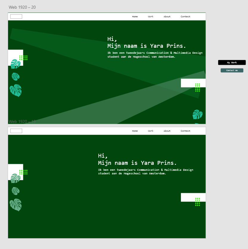
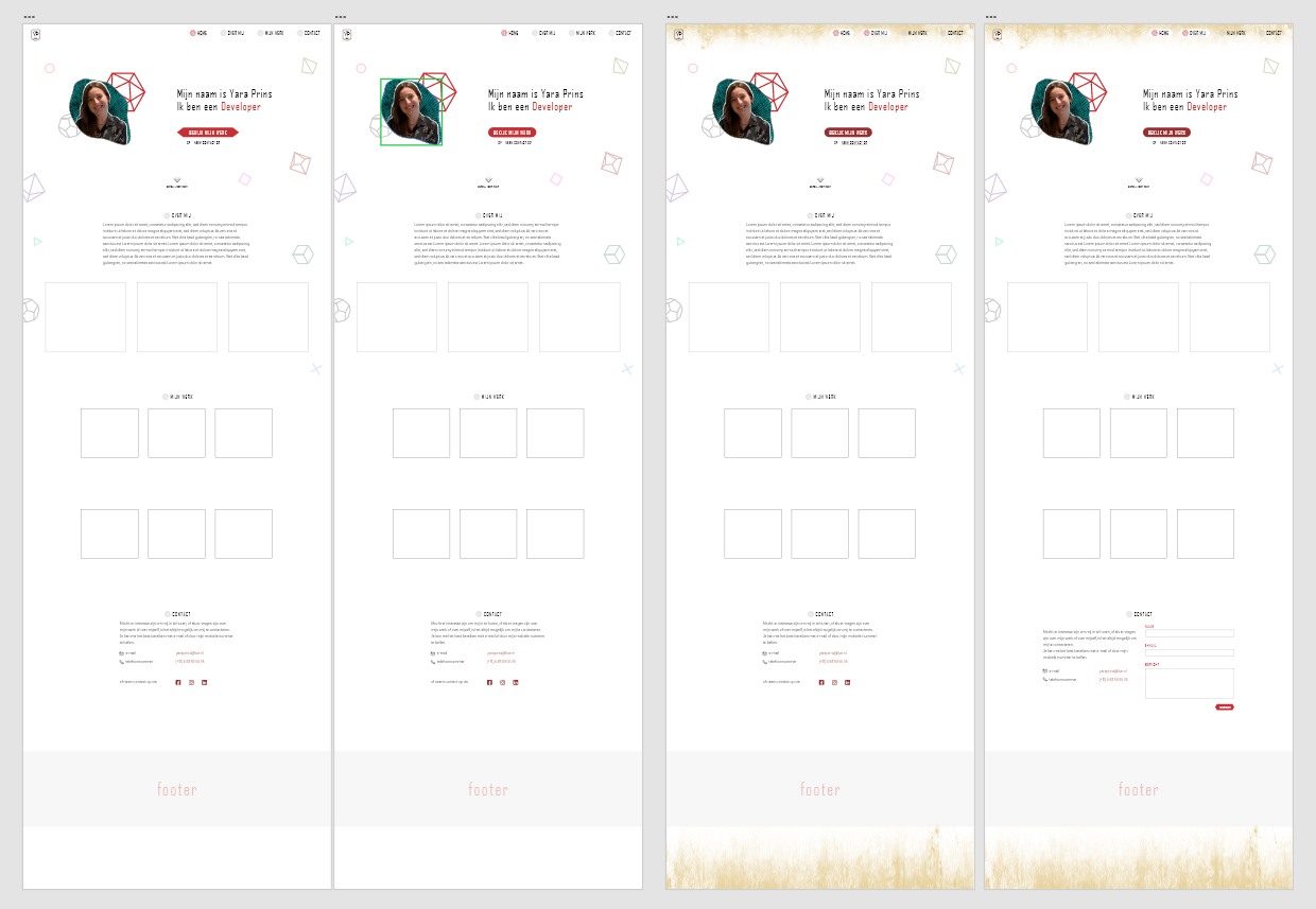
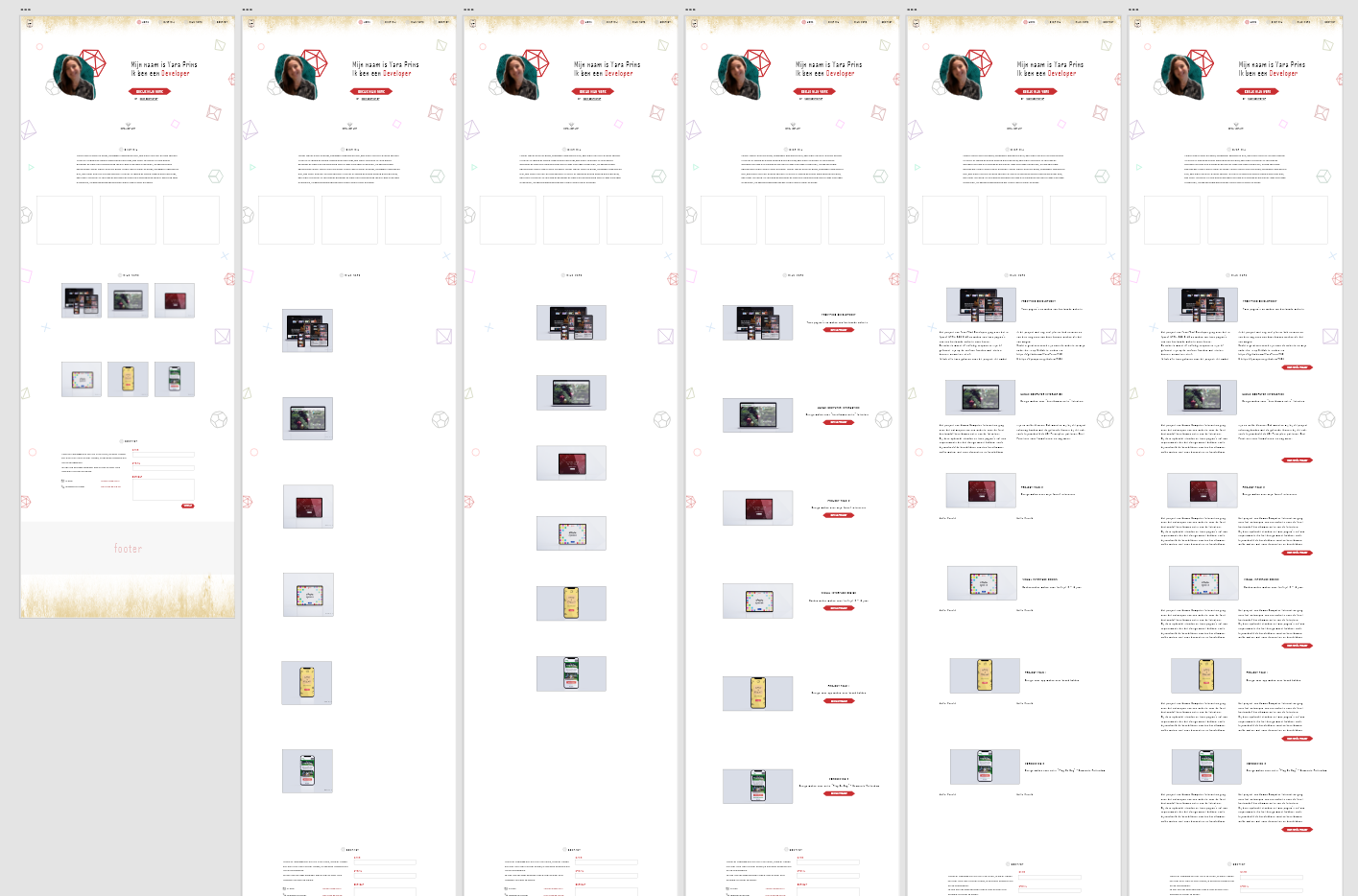
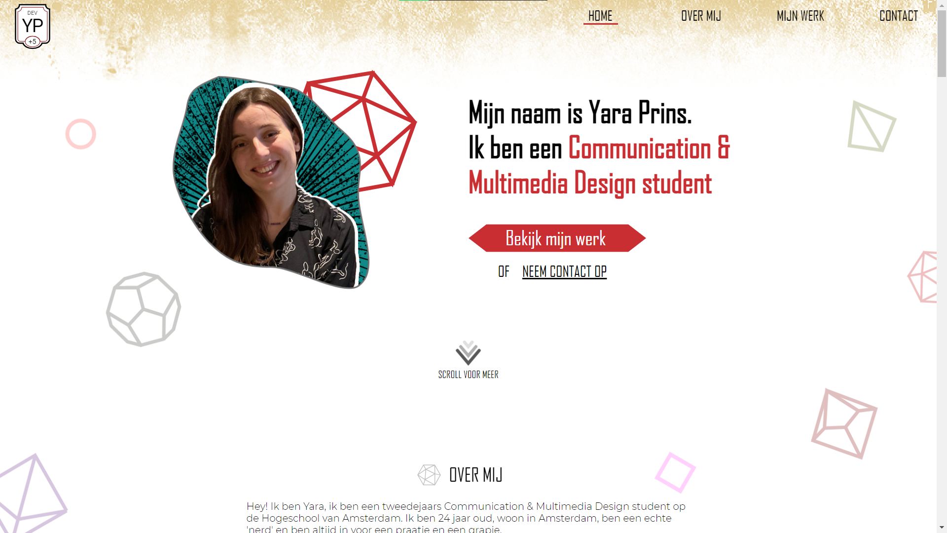
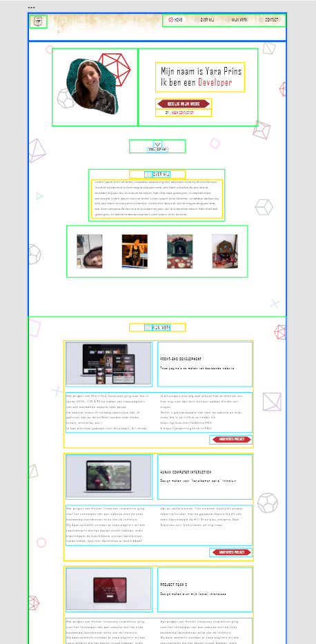
Starting this first portfolio, I was slightly struggeling. Not on anything bad, I just didn't know at first what kind of design I wanted to go for. I made a few early versions, but was not satisfied with those. So, I started from the beginning, writing down who I am, what I like, and what I care for, in bullet points. From there, I quickly realized that a lot of the things, came down to me just being a geek and nerd haha! So, why not go with that vibe? I collected some free assets, and began to make a few designs. I eventually had this idea of the page to look like something from a D&D page, or an old fantasy page in general. I knew I wanted the rest of the page to be a bit more calm, so it wouldn't be to overwhelming.
So, I decided to for the rest to have a simple white background. This however, eventually felt a bit too empty. And decided to add a slight pattern. This pattern would not only be something from D&D, but also some other things. Enter, the gaming part of the portfolio haha, the Playstation icons, together with the dice icons from my love for roleplaying games, spread around the page.
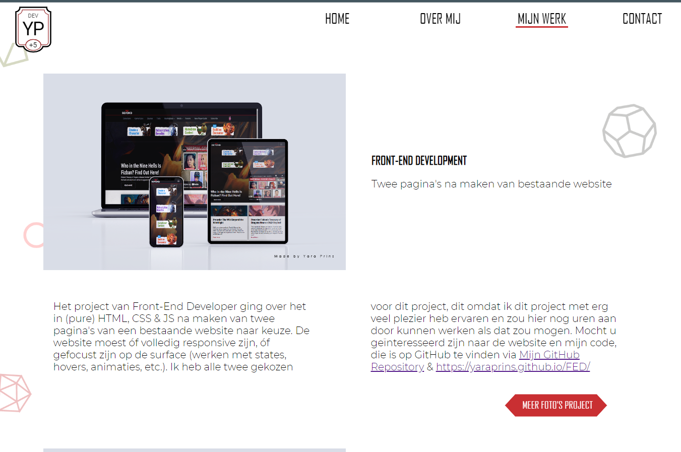
I also made a few versions of how I wanted to show my projects, what layout and placement I wanted it to be like. These versions will be also shown below.
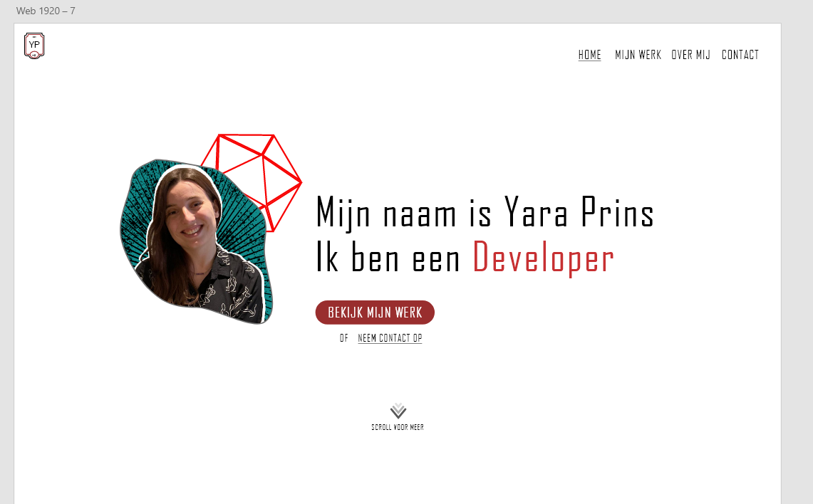
After making the final version of the design, I roughly made a breakdown sketch, of how the page would fit together and what the elements would be. That way I would have a better start to finish coding it.
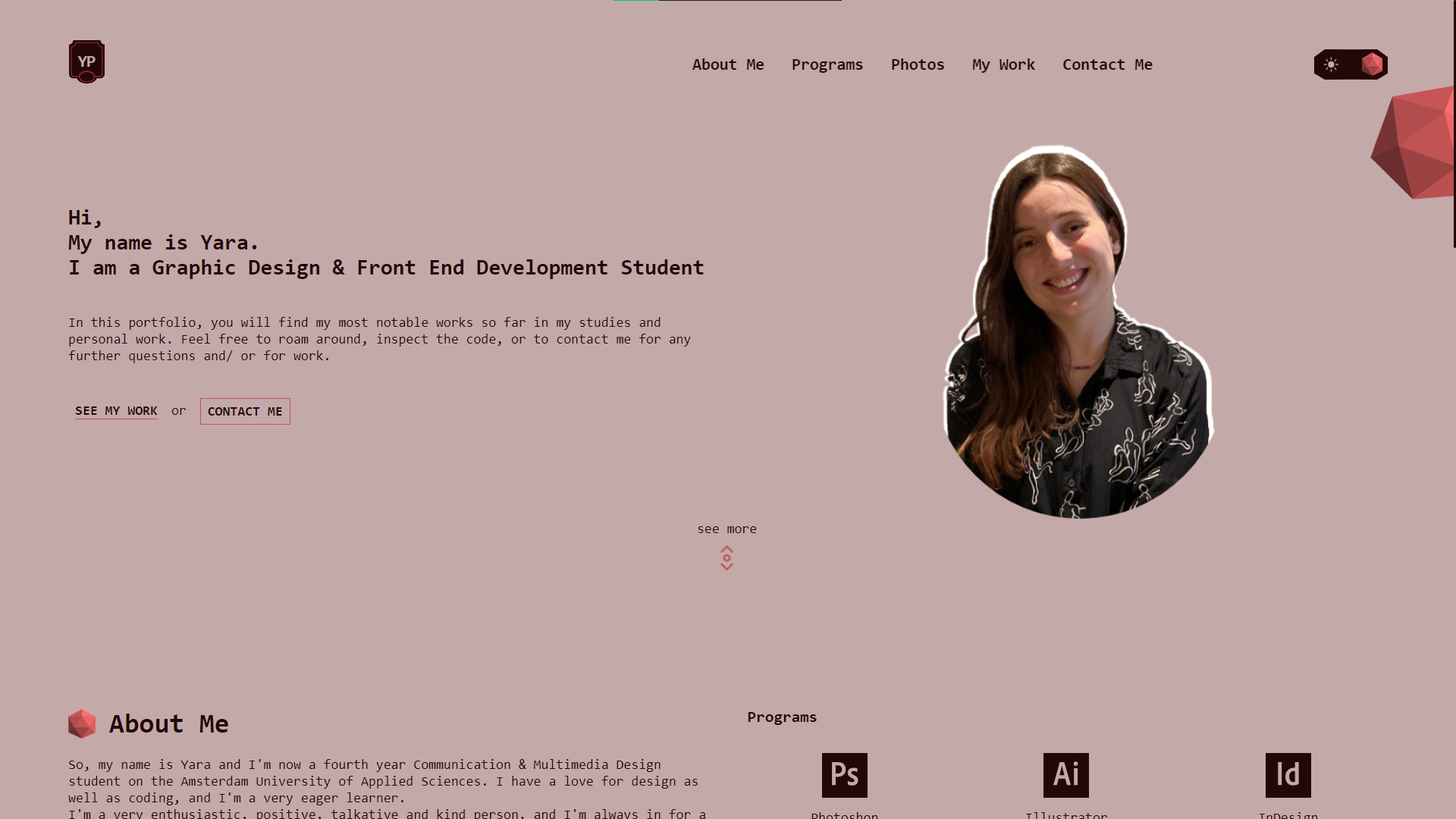
Fast forward about two years, I wanted to not only update my portfolio, but make a complete redesign for it. This because I knew, it would be better practice to make my portfolio in English and I also wanted to go for a more minimalistic design for this new one. Not only that, I wanted to show that my coding skills and knowledge have improved since making the first one. That are some of the reasons why I wanted to remake this portfolio.
Coding
Coding this portfolio went quite well. Making the breakdown sketch helped a lot for me to quickly have the basics in HTML set. I then followed the designs I made, piece by piece, starting from the header.
After setting up the main things of the page, I knew I wanted to make some additions to it, to show my skill level. A few things were made by me to achieve this. I used the Intersection Observer in JavaScript, to see where users where on my portfolio, and correspond that to the navigation indicator. I could have simply used an observer for the Y coordinate of the page, which I did at first, but I quickly realized it wouldn't work with the other thing I had in mind.
You see, I wanted users to let more images be shown for my projects, when they would click on a button. This would mean, the Y coordinate would not be correct when scrolling and having all of those parts open. Hence, me working with Intersection Observer. It did take me some research to get this up and running, but it eventually worked perfectly!
The second part that I'm quite proud of, was the ability to click on the images from my projects, and then be shown the full sized, high quality version of these images. Not only that, but you are also able to switch images back and forth by clicking the next and previous buttons, like a carousel.
I have also thought of the performance part of it, having two versions of the images ready. The initial small images that are shown, are down-sized and are much smaller MB wise. Then, when clicking on the images, the full will be shown, that are saved in the normal resolution.
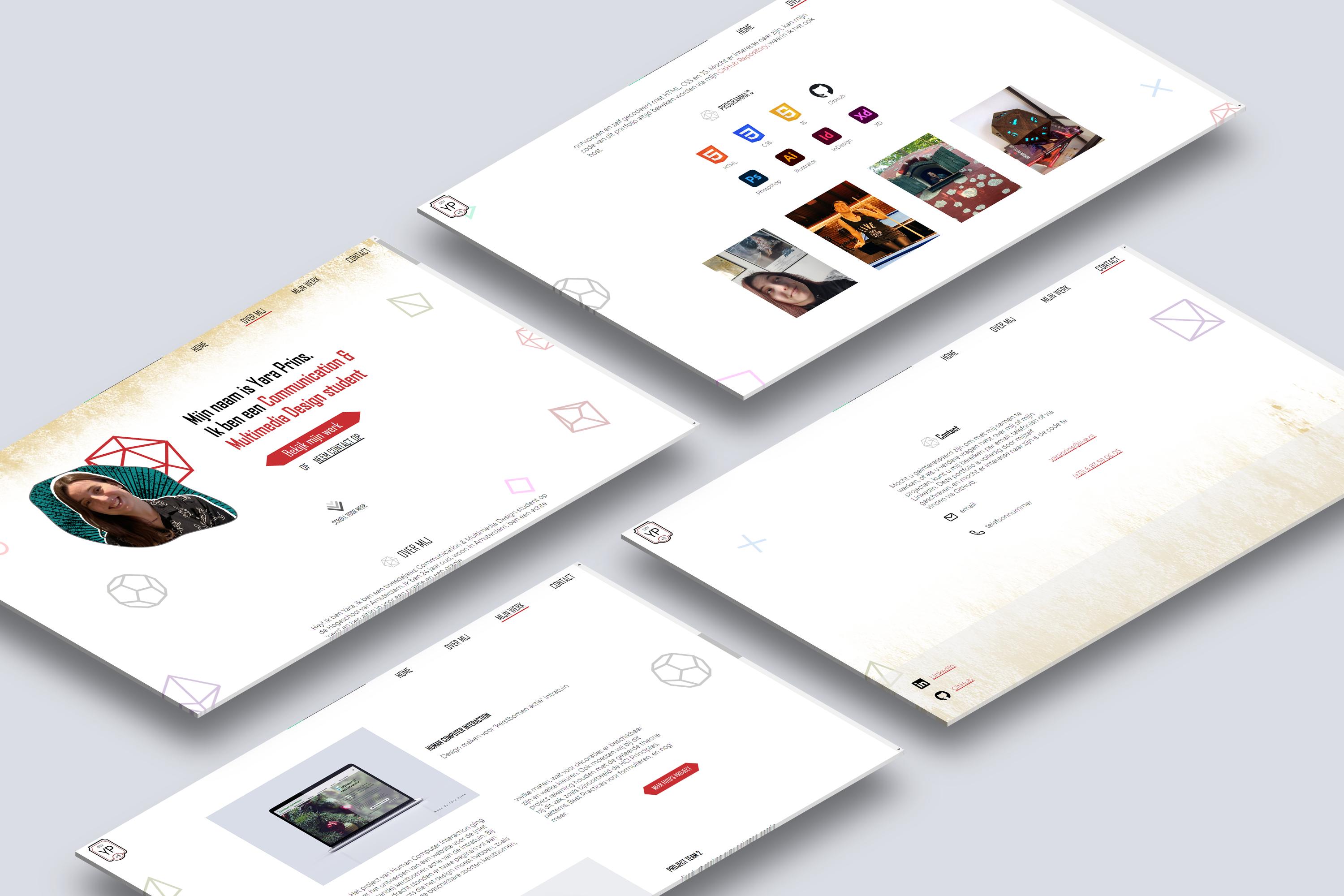
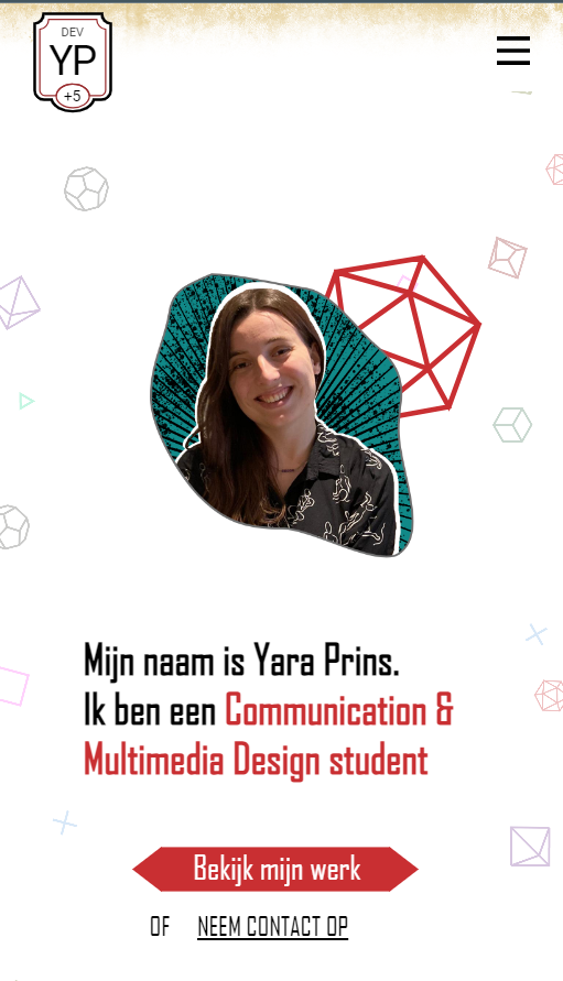
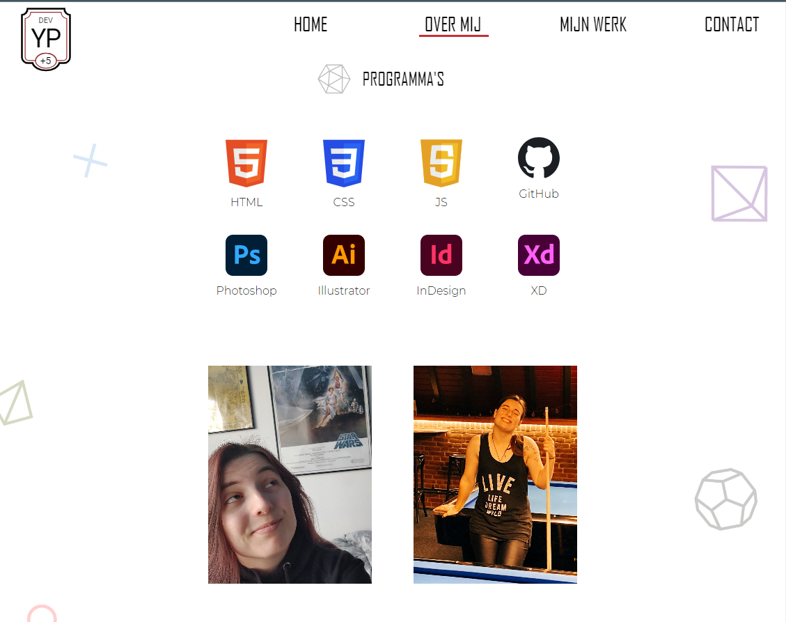
Final Design Responsive
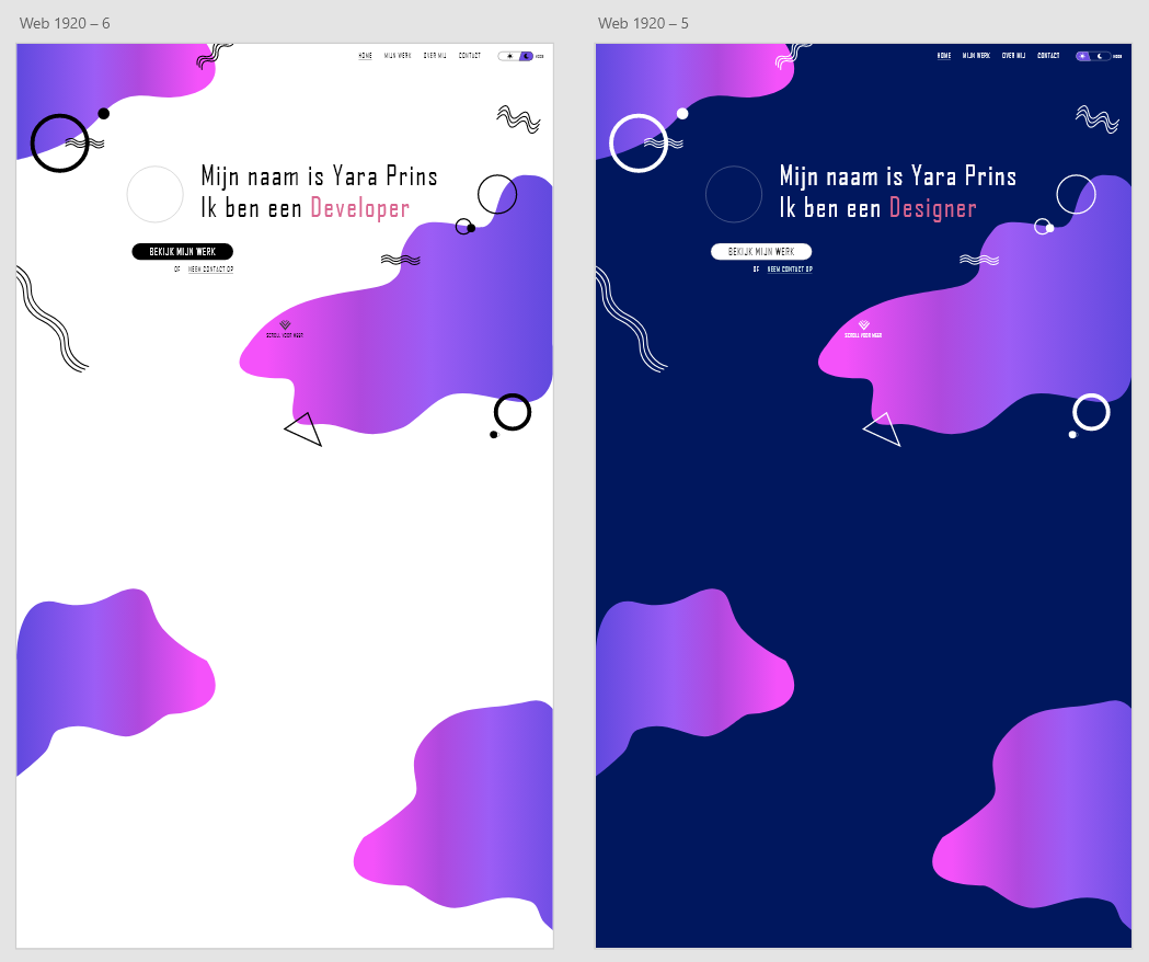
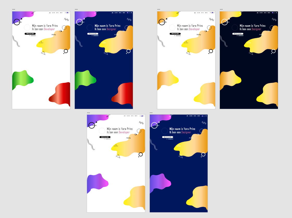
Early Versions and Iterations