Plog De Dag
This was a project for one of my classes, called Vormgeving (translated "Design"). During this class, we had two individual assignments. One of which, was called Plog De Dag, a fictional project for the municipality Rotterdam (Gemeente Rotterdam).
In this project, we were tasked with designing a web page for this project, in the brand identity of Gemeente Rotterdam. For this project we needed to think about responsiveness, and use the style guide from Gemeente Rotterdam to give the feel as if it was offically done by them.
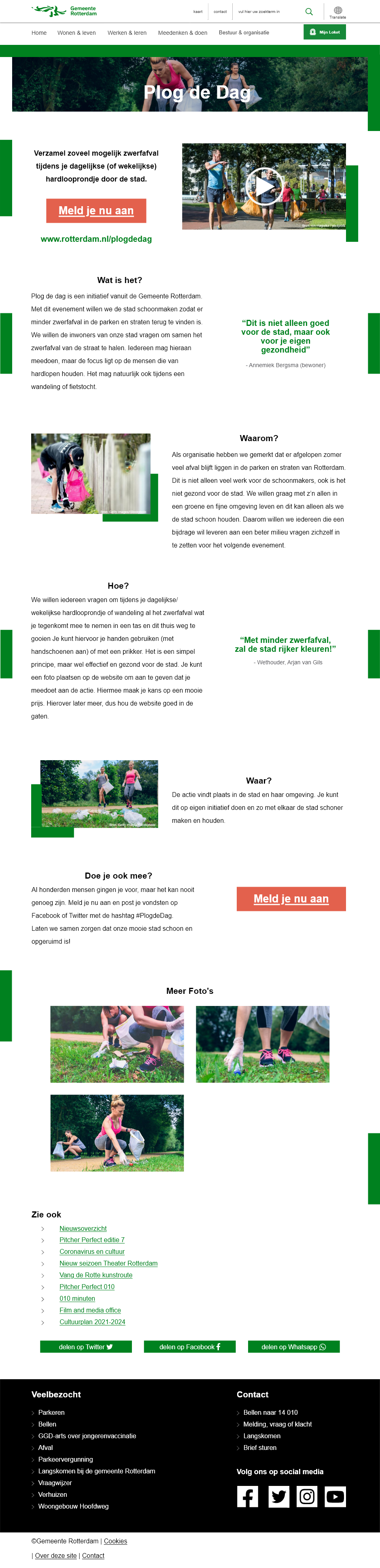
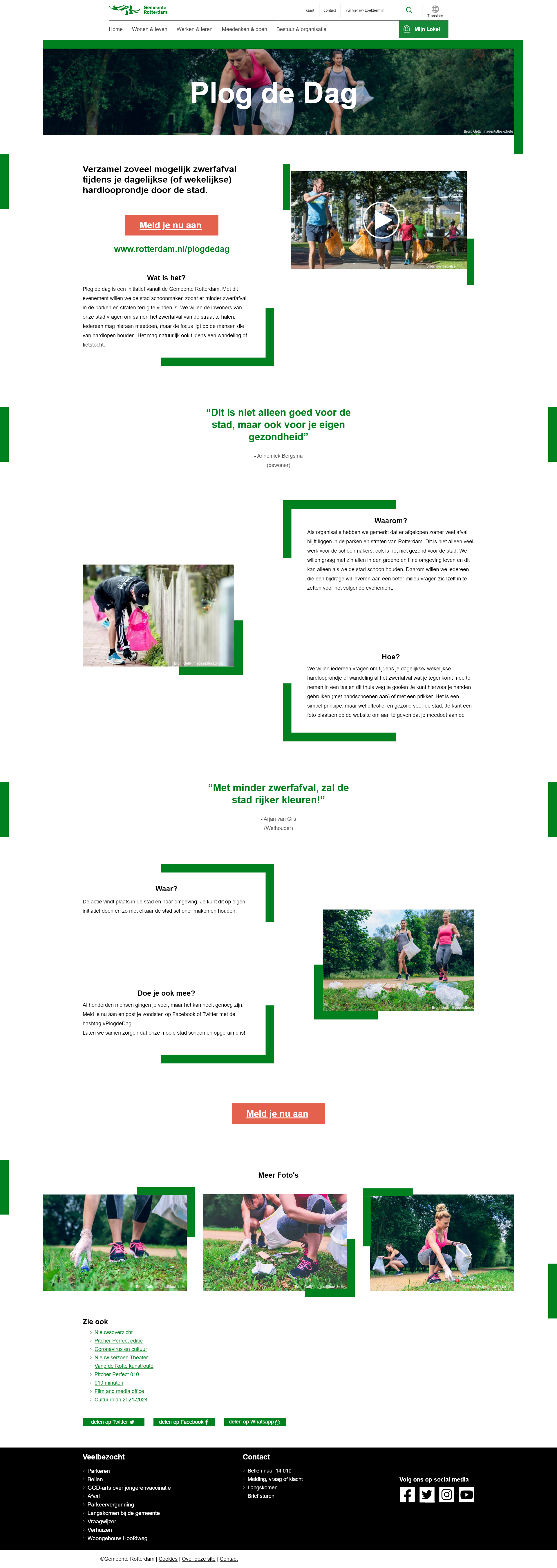
The fictional project Plog De Dag, is explained to be an initiative from the municipality, to have walkers, runners and cyclists collect loose plastic and other trash on their way. People who want to participate in the initiative, can sign up on the website and make pictures of their collected trash, for a chance to win a price (provided by the municipality). This way, the city wants to make sure it is cleaner, safer and a has a more friendly nature.
Process
Start
I started with going through the content provided for this project, and studying the style guide from Gemeente Rotterdam. I collected the necessary colors, fonts and logos, and noted the spacing and alignments between text, columns, images, links, buttons and logos.
Then I started working on the layout and the first iterations of the design. Working with an existing style guide, I could make these design ideas quite fast, but it still needed some work.
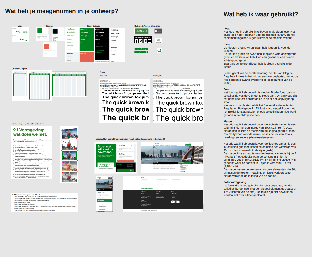
The screenshot provided is of a few things I took and used from the provided style guide, making sure I kept it feeling like it was made offically for the municipality.
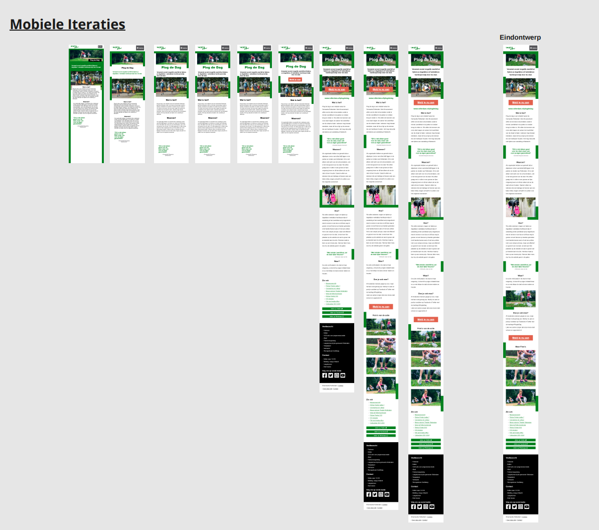
Iterations
I started with making the mobile design. I knew this would be a one column design, and it would be faster to work with. Here is where I layed the ground works for my ultimate design, and worked my way out from the ultimate phone design to tablet and desktop.
In the first version I made, I wanted to incorporate and highlight the green color, seeing the initiative had to do with cleaning up and be better for nature. But, I soon realised that putting that much green as a background color, would distract the user from the main content. So, I made a iteration where I had partially made use of the green color in form of smaller blocks.
This worked out quite well, and now I just had to play around with placement, font size and spacing, button color and size and with color for headings and such.
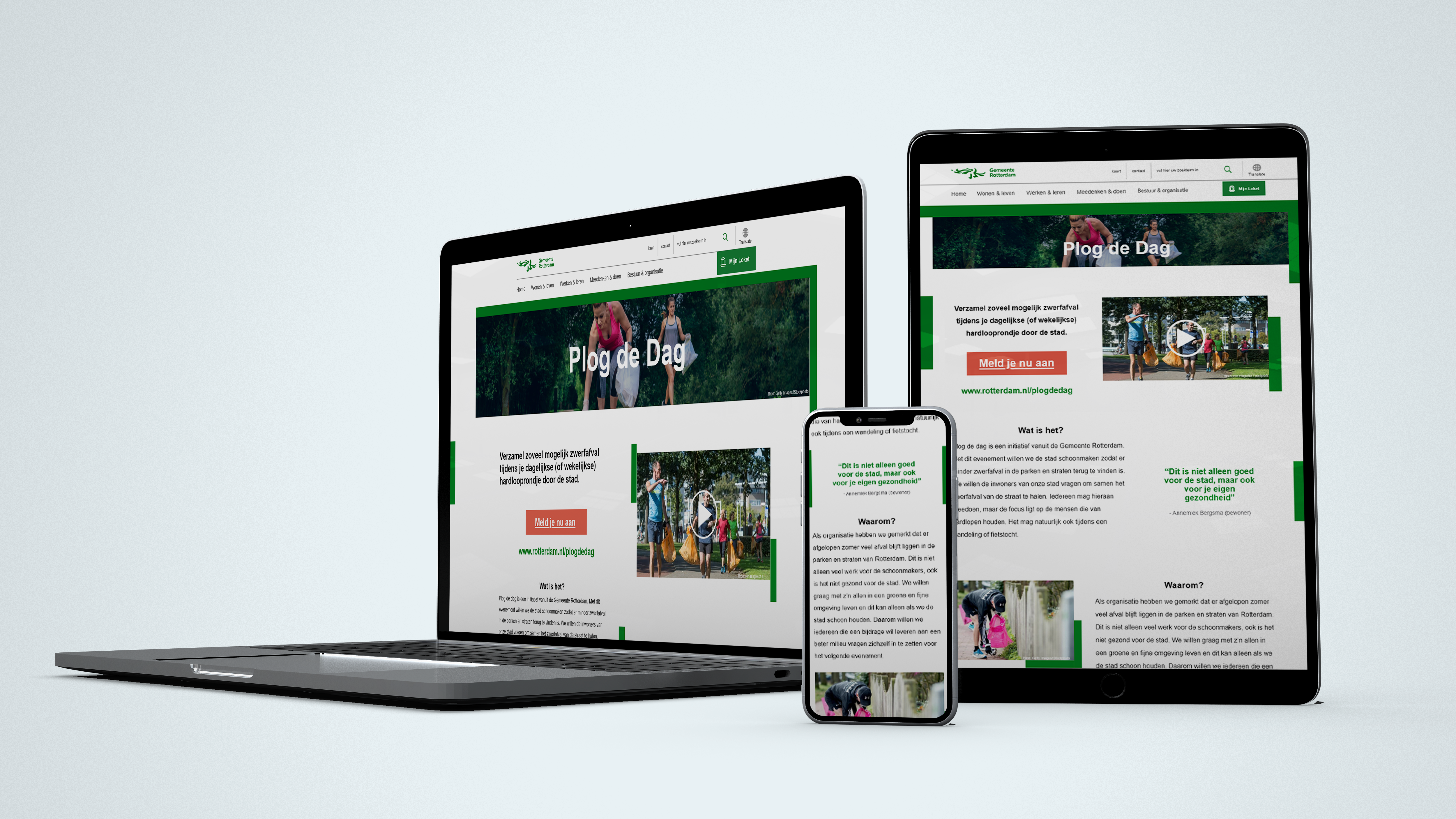
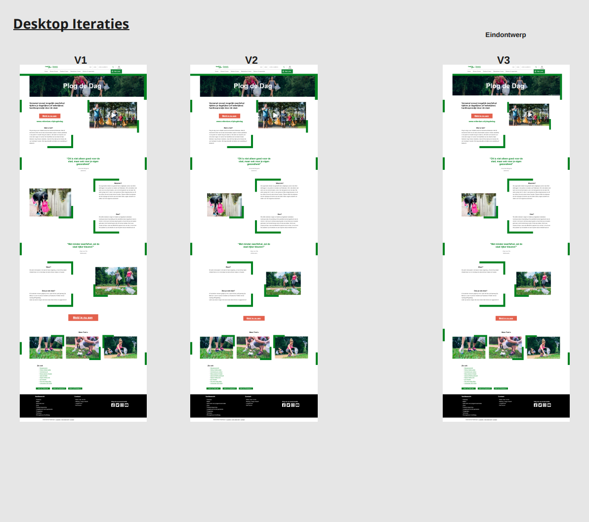
After making the final version of the mobile design, converting it to tablet and desktop was quite easy and fast to do, just needed to think about placement but that was really it.
Iterations and Final Design

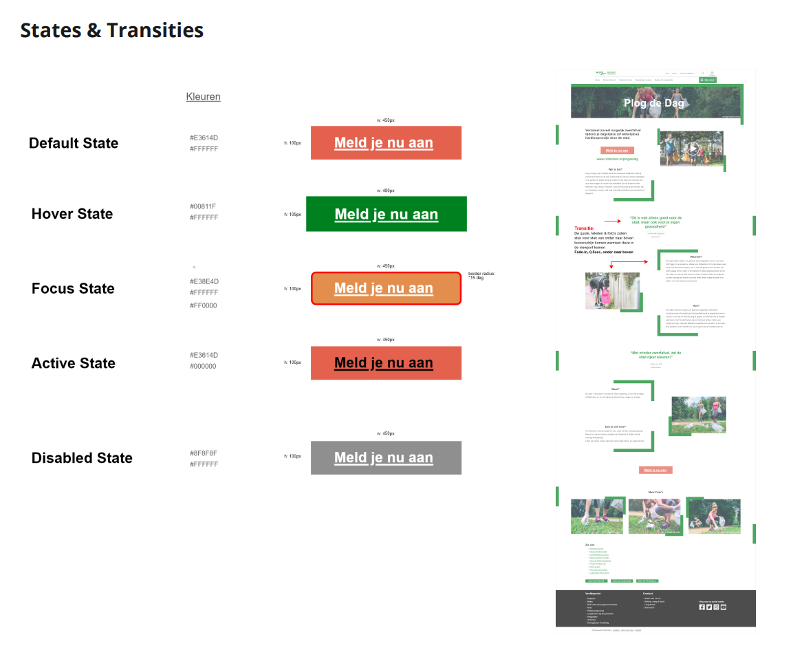
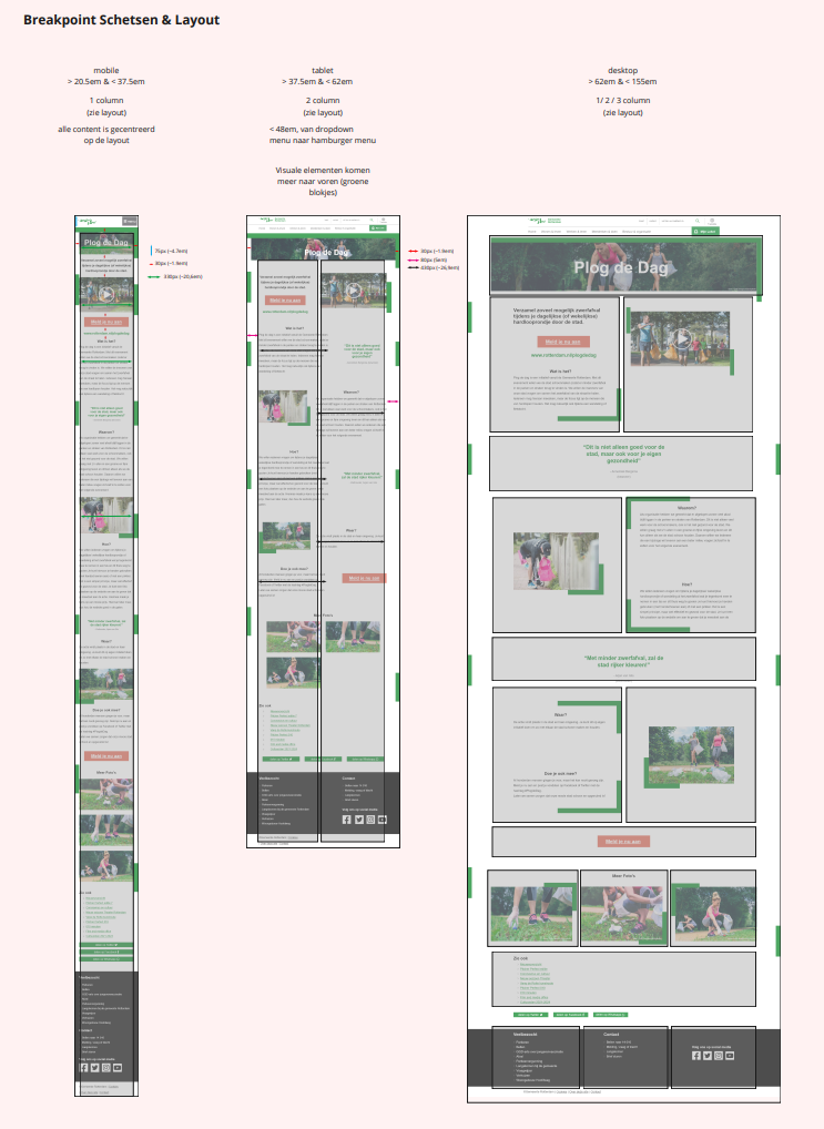
Button States and Transistions, Breakpoint Layout