D&D Beyond Replica
This was a project for one of my classes, called Front-End Development. During this class we continued to keep ourselves busy with learning HTML, CSS and JavaScript.
In this project, we were tasked to choose one website, for example one which we regularly made used of, and to recreate two pages of that website in our own code, with vanilla HTML, CSS and JS.
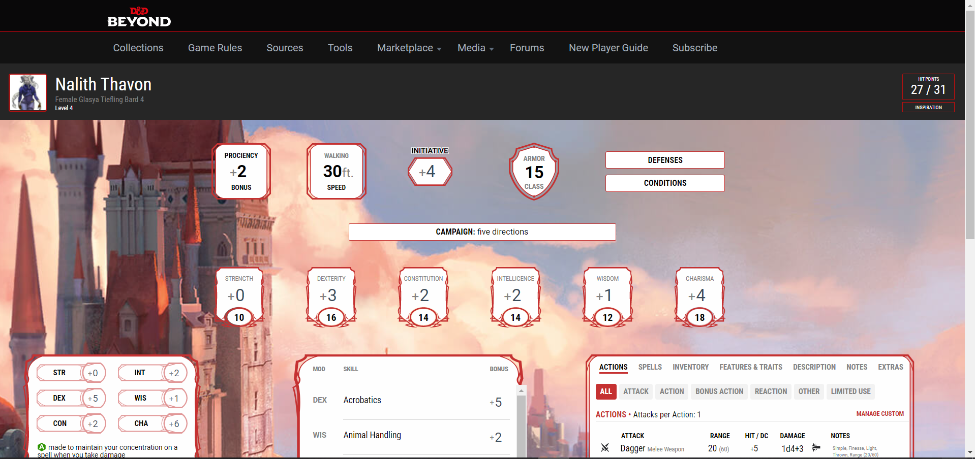
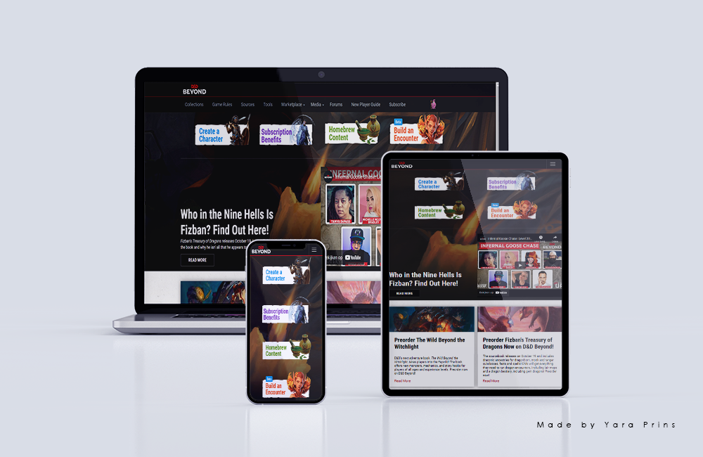
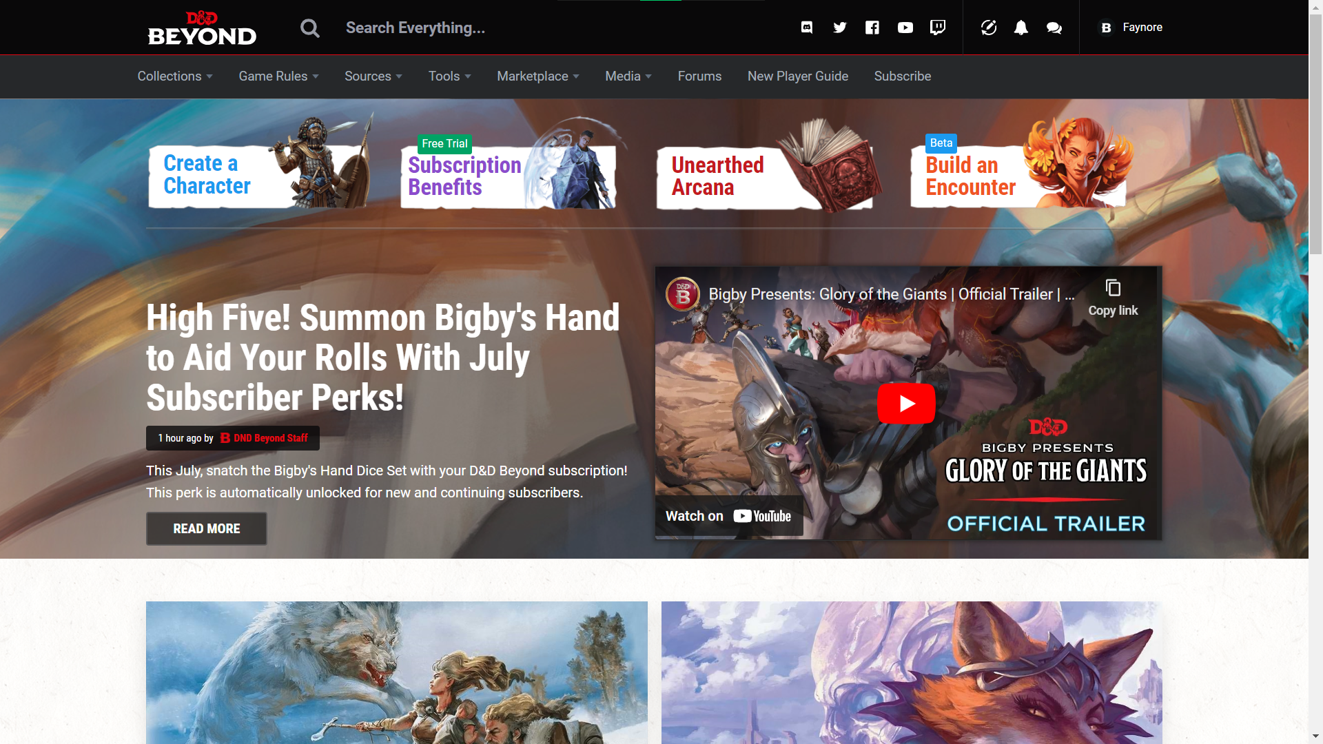
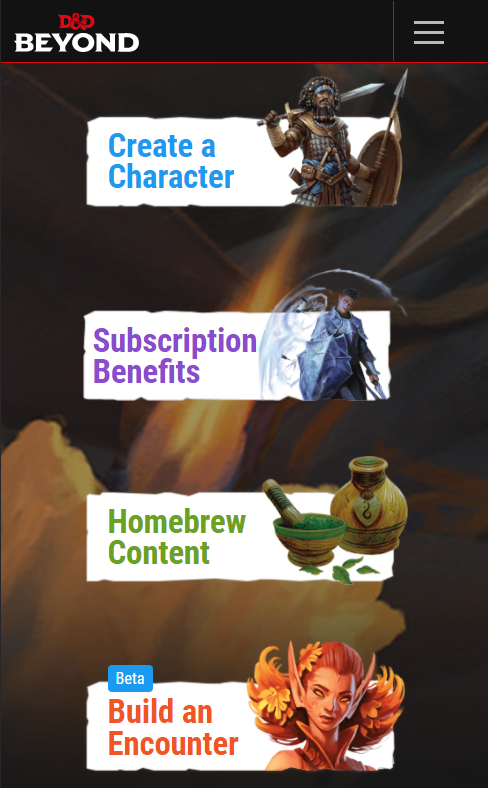
The website I decided to replicate was the website dndbeyond.com, a website dedicated to the popular tabletop roleplaying game Dungeons & Dragons
You can find this project on my GitHub Repository
With this project, students of this class were given the option to either make the chosen website responsive, ranging from desktop to a phone viewport, or focus on the surface side of making a website (hover and active states, animations, sound effects, etc).
I enjoyed this project so much, that I decided to focus on both the responsive and the surface side of this assignment.
I'm very proud of how this project turned out, and if interested, you can look into my GitHub repository which holds the code for this replica. You can also browse it live on yaraprins.github.io/FED/
(I'm curious to know if you can find the rainbow wizard...)
Process
Start
I started this project with brainstorming about what website I could potentially replicate and which website interested me the most. During this brainstorming session, I soon thought of a website I very often make use of: D&D Beyond. I use this website often, since it's a useful tool for the game Dungeons & Dragons, one of my favorite hobby's.
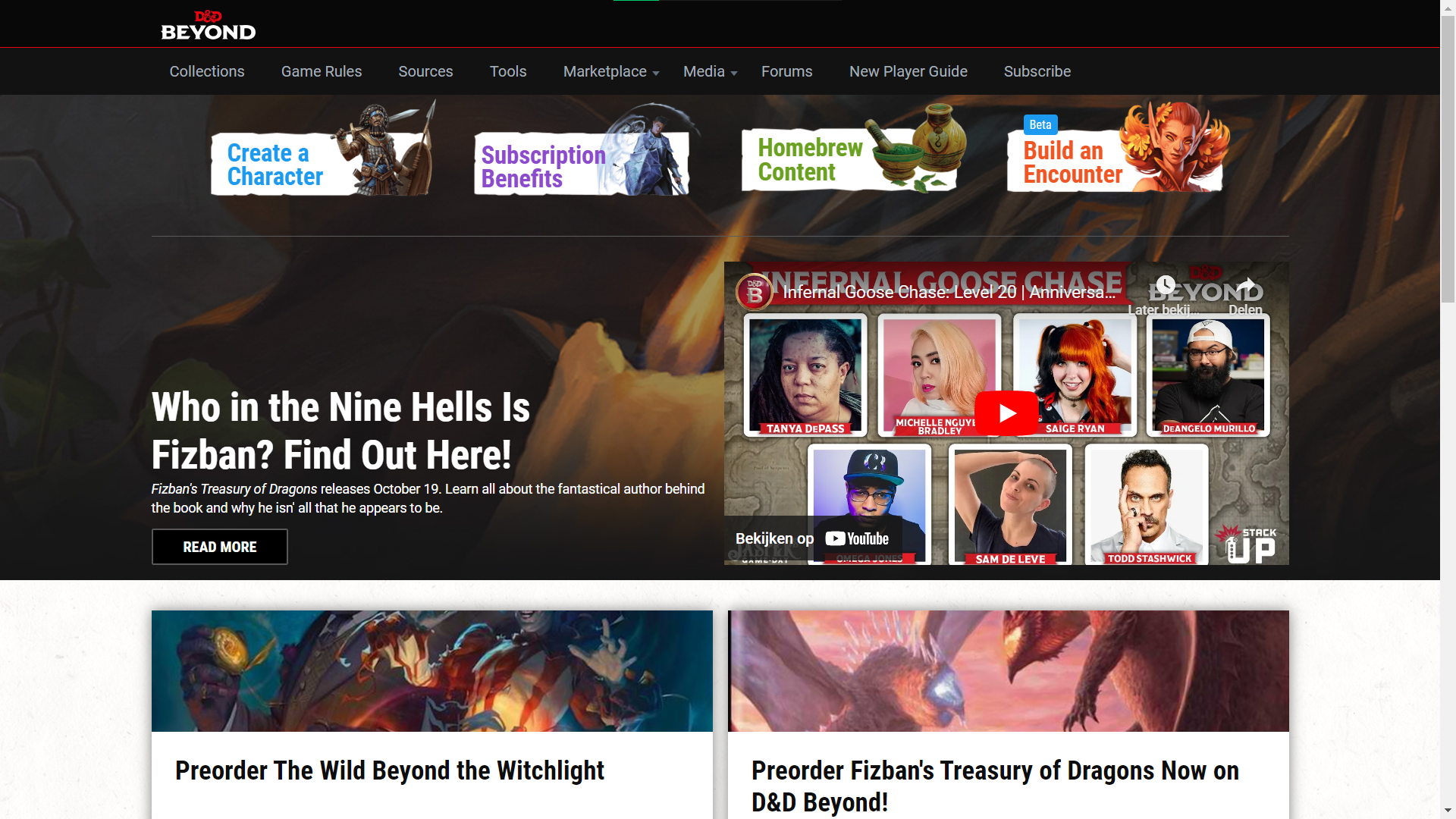
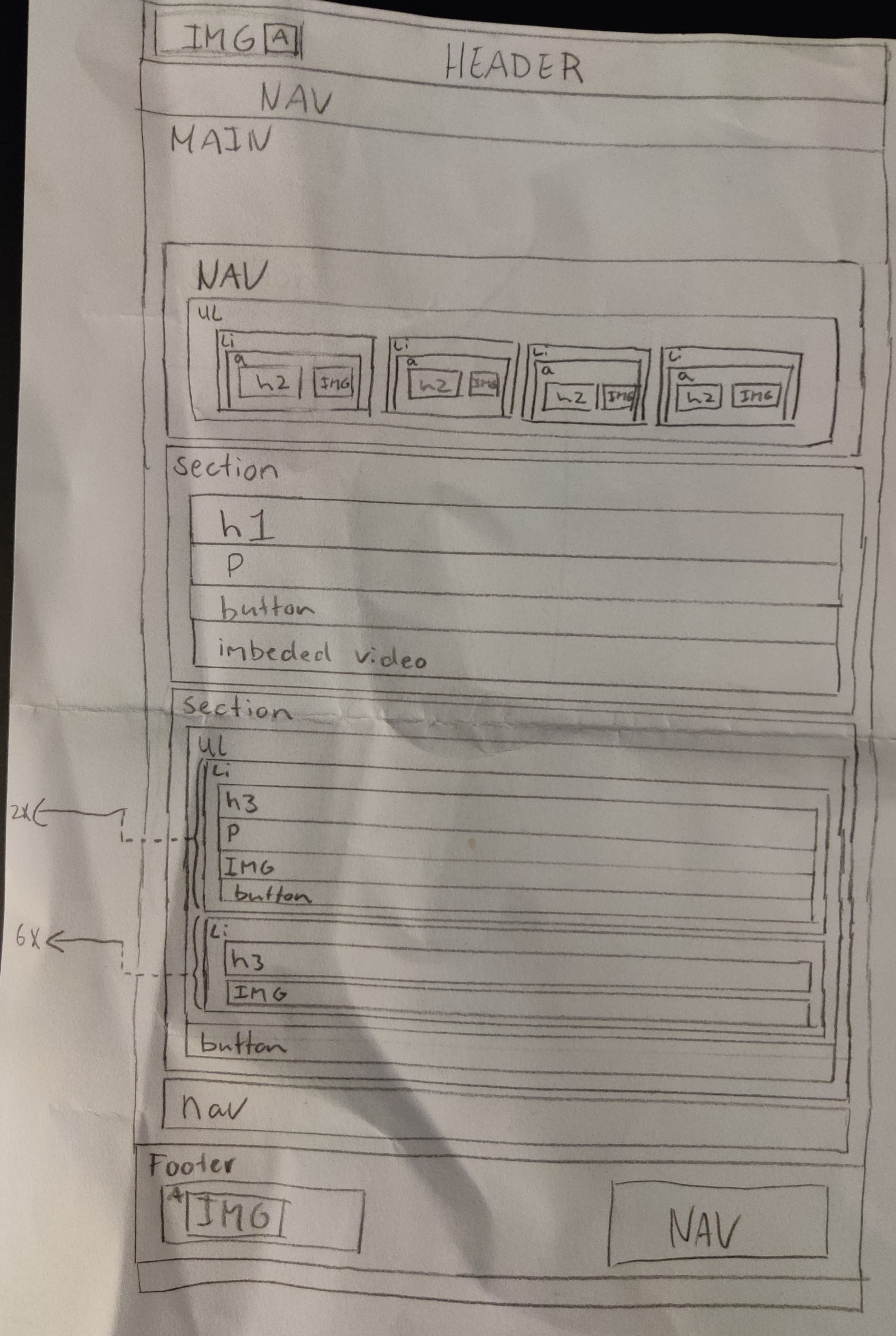
After brainstorming, I studied the original website, and thought of two pages on that site I wanted to replicate, and made a breakdown sketch of those pages.
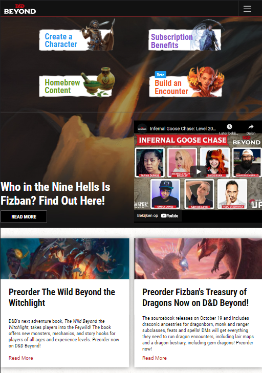
It was then time for me to start coding. I knew my level of coding was pretty high already, and that's why I wanted to challenge myself by not only making a complicated page, but also make it fully responsive and make it look pretty.
Coding
I started by coding the main page first. My process in coding this was quite simple, I started (mobile first) with coding the header, followed by the main and footer, and lastly made it responsive and any other bonus points. When coding parts at the time, I write the HTML first, making sure I have put in everything I need, and then style it with CSS (and potentially make it functional with JavaScript).
When the header was done, I continued to write the main, section by section. During writing the code for this page, I started coding with grid for the first time at that point. I must say, quite intuitive to learn! It didn't take me much time to finish coding the footer, but what did take some time, was making the page responsive (especially the menu). This was quite tricky, but eventually I managed to get it to work nicely.
I even had time to make a nice easteregg in the menu (well, replicating the easteregg hidden in the orignal website). It took a bit of time to get it working, but I'm very proud of how that one turned out.
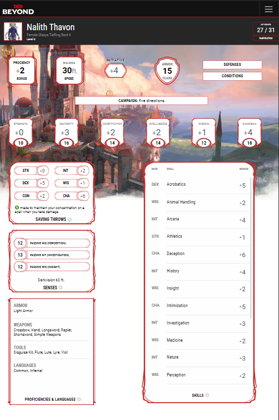
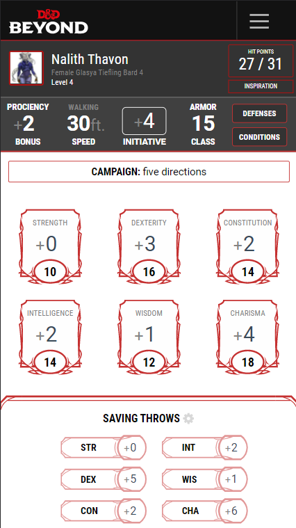
Coding the second page was taking quite a lot more time, seeing it consisted of much more complicated aspects, such as having quite a lot of different styled columns, rows and sizes, mixed with custom borders. Replicating the responsive design of this second page was especially tricky. It had three different stylings, where the first one (mobile design) was completely different than the other two.
But! After a ton of hard work, frustrating moments, and a love for coding, I managed to make quite a decent replica if I may say so myself! (and appearanly said by my professor as well, seeing I managed to get an A).
First Page Responsive
Second Page Responsive