Boekenzoeker
This was a project for one of my first year classes, called Visual Interface Design. During this class we were given a fictional assignment from the municipality Amsterdam (Gemeente Amsterdam).
The project was an initiative from the municipality, for students between the ages 12 and 15, to easily find books that might interest them, are at their level, and find books that are on the "read for the list" (lezen voor de lijst).
For the project, I needed to come up with a bookfinder app, in the style guide of municipality Amsterdam, but aimed at the students. It had a few other key points that needed to be inncorporated, but other than that we had the creative liberty to make what we wanted. There had been quite a lot of iterations for the design but I'm very glad how it turned out. You can find the protototype for the app here on Adobe XD
Process
Start
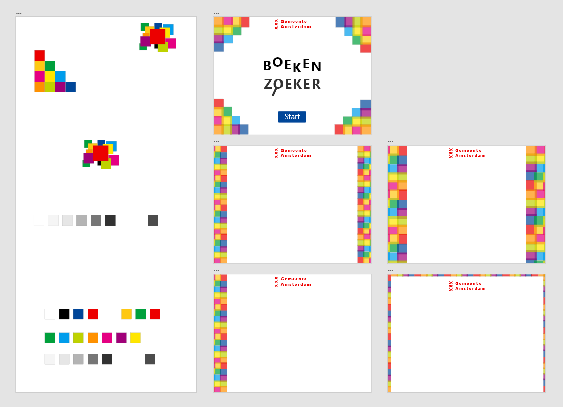
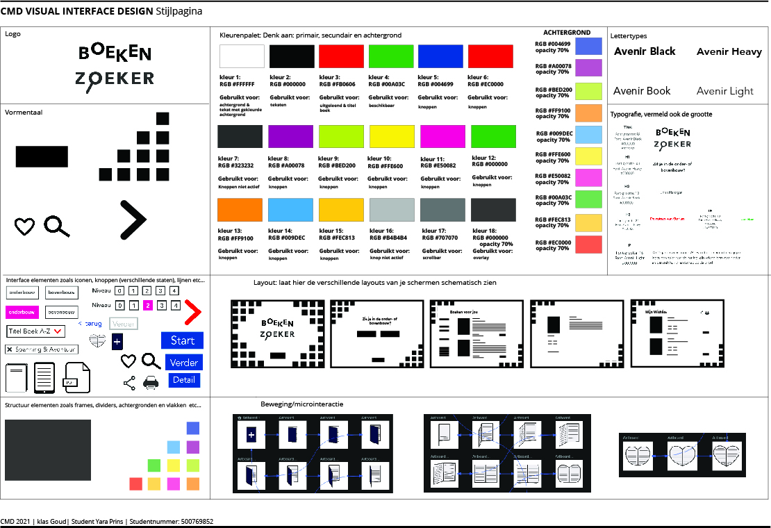
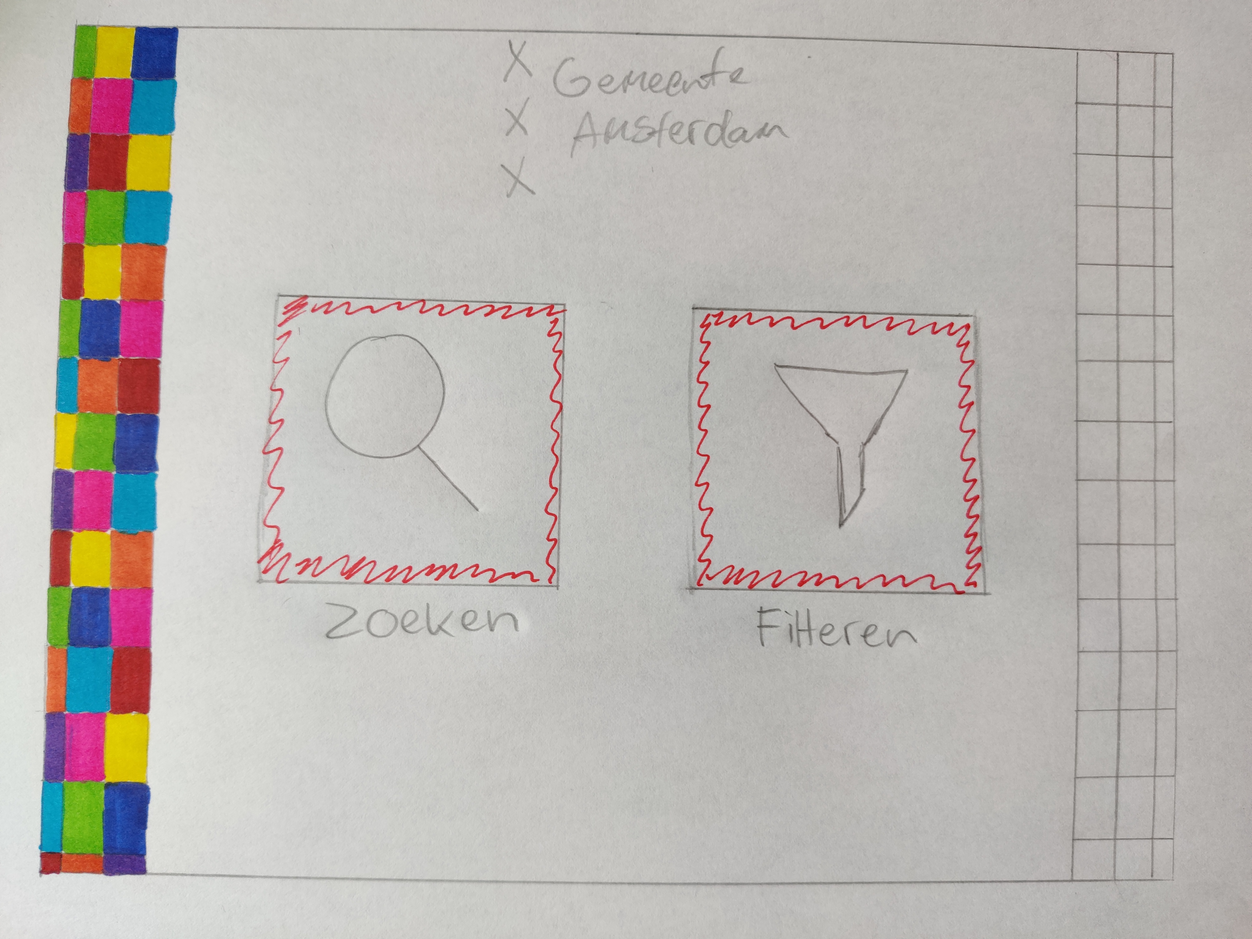
I started with going through the content provided for this project, and studying the style guide from Gemeente Amsterdam. I collected the necessary colors, fonts and logos, and noted the spacing and alignments between text, columns, images, links, buttons and logos.
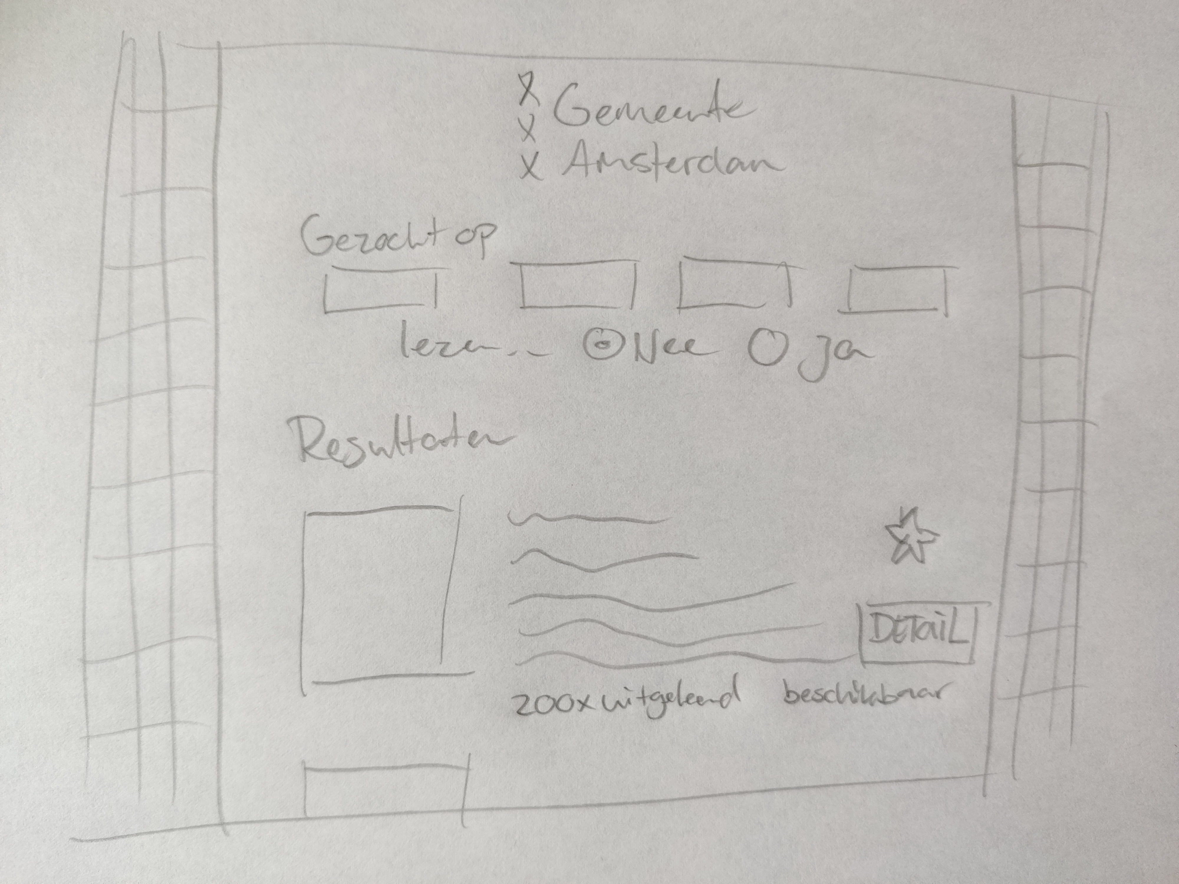
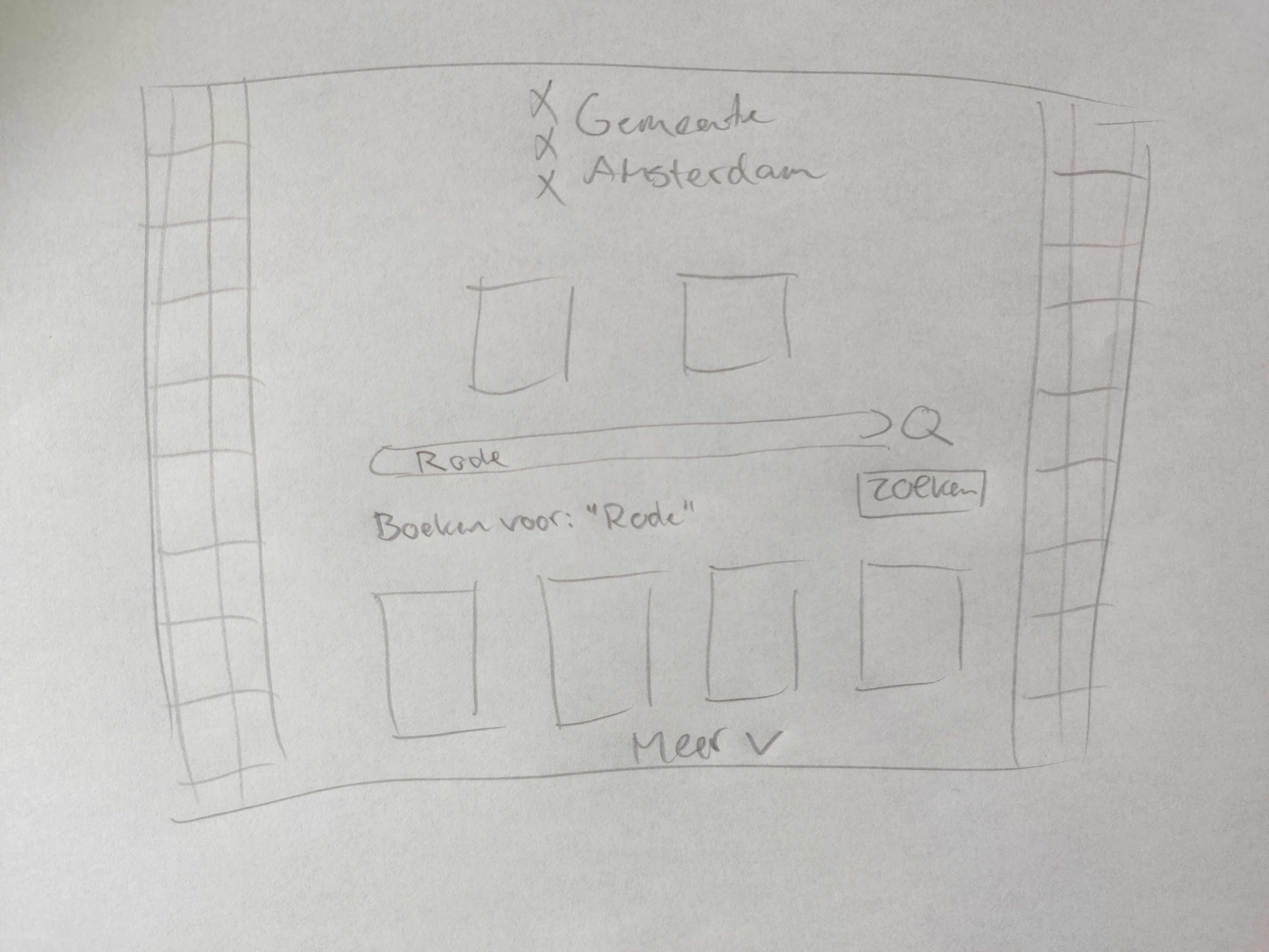
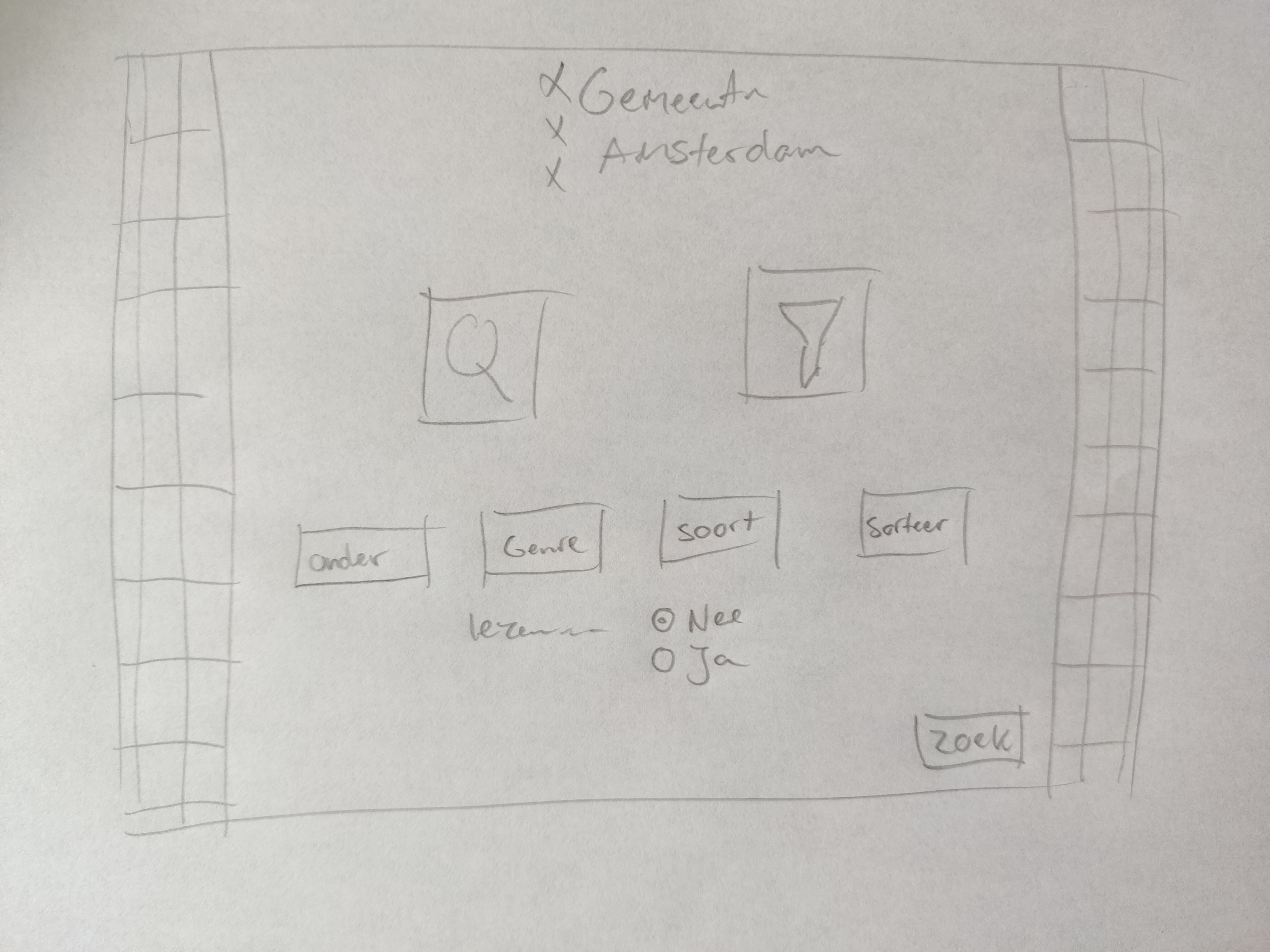
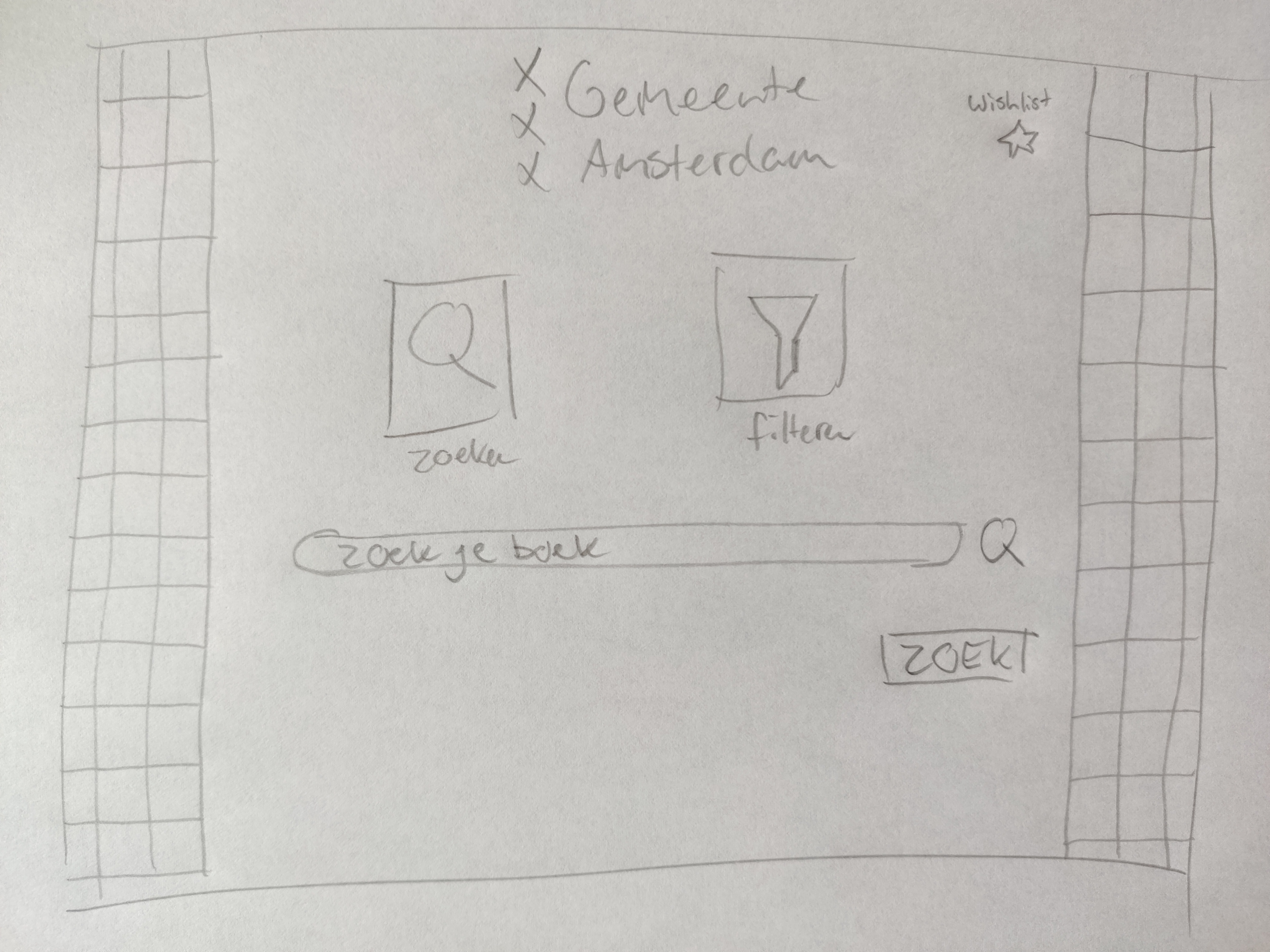
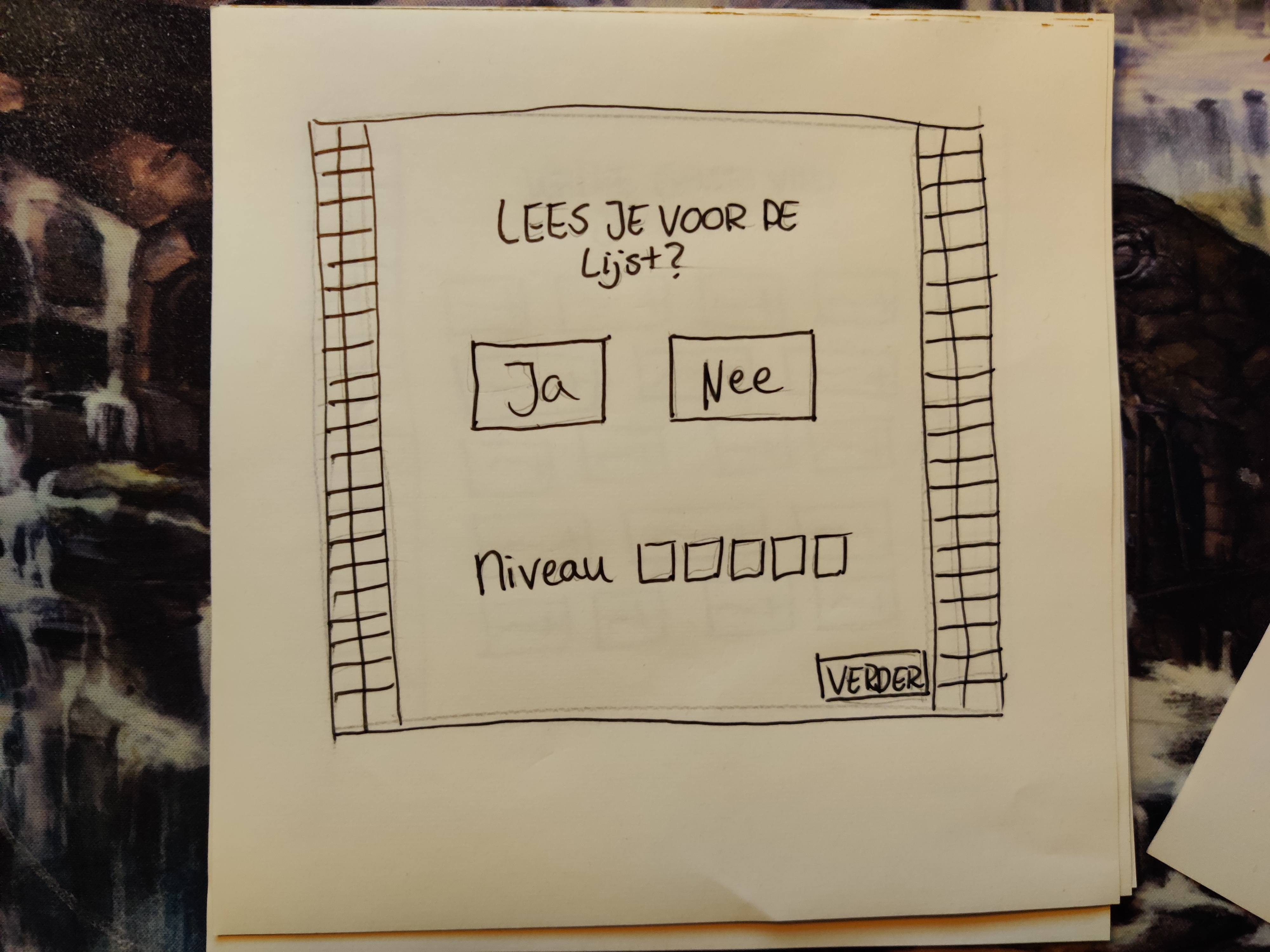
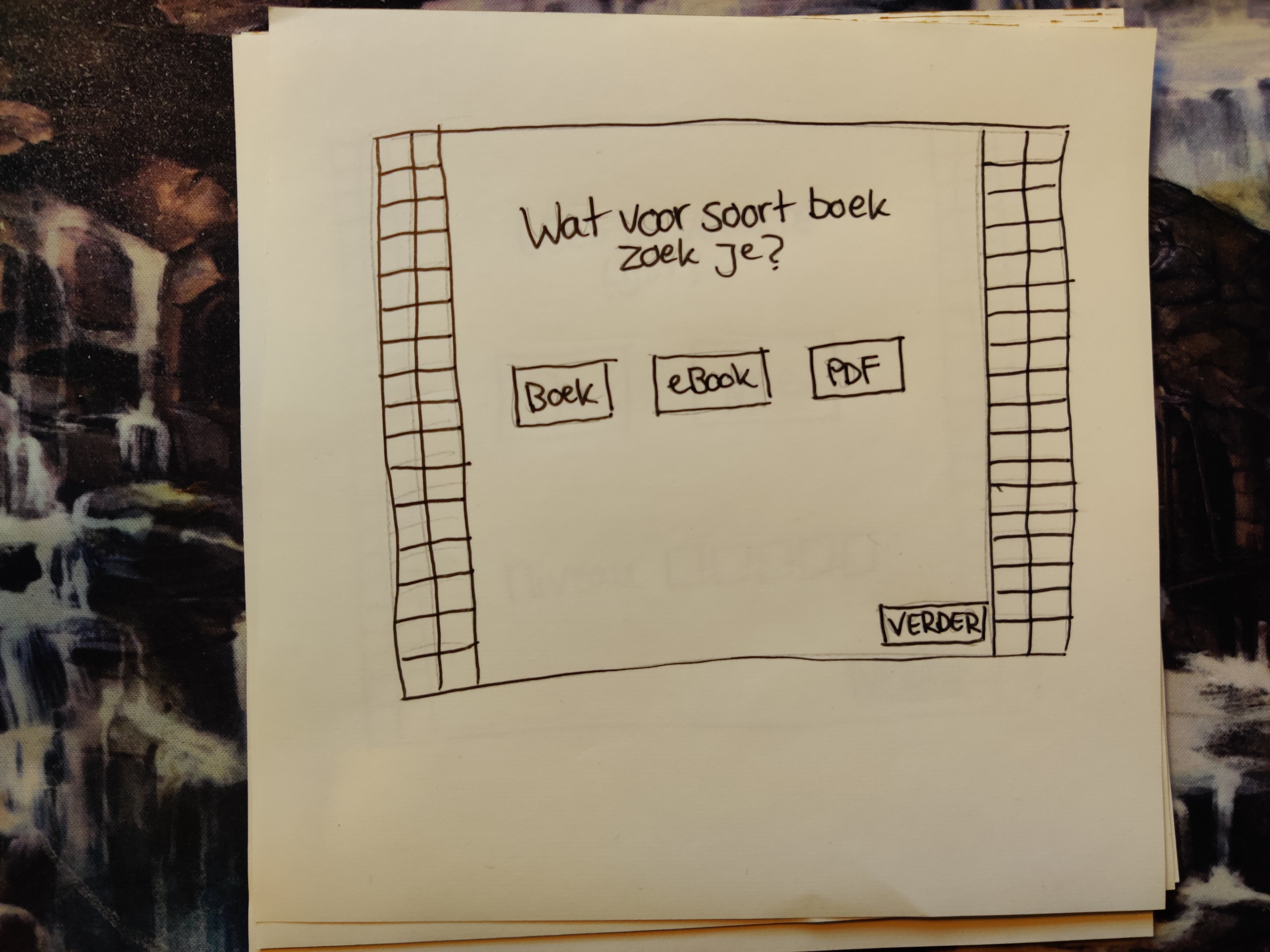
Then I started working on the layout and the first sketches and iterations of the design. Working with an existing style guide, I could make these design ideas quite fast, but it still needed some work.
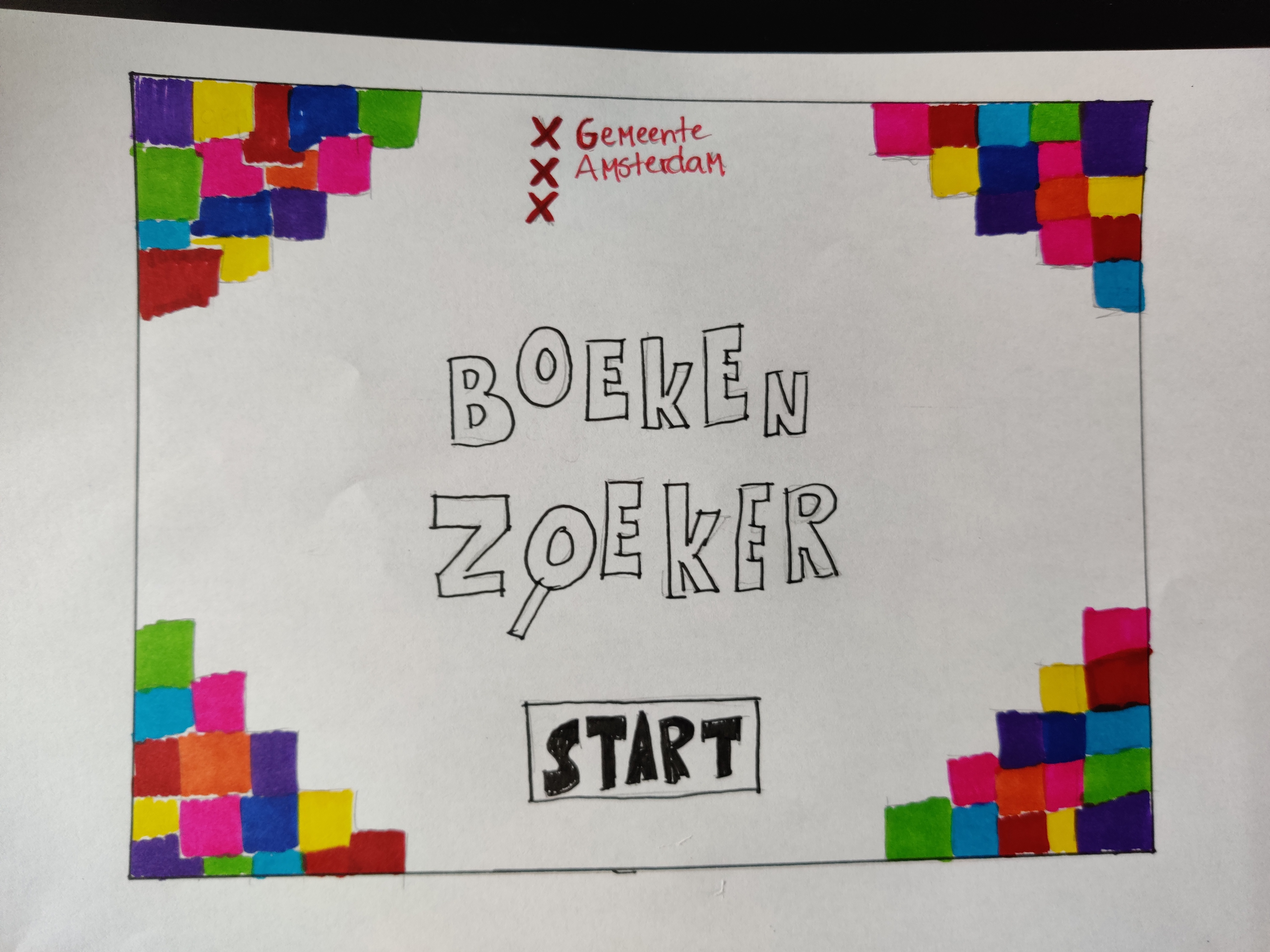
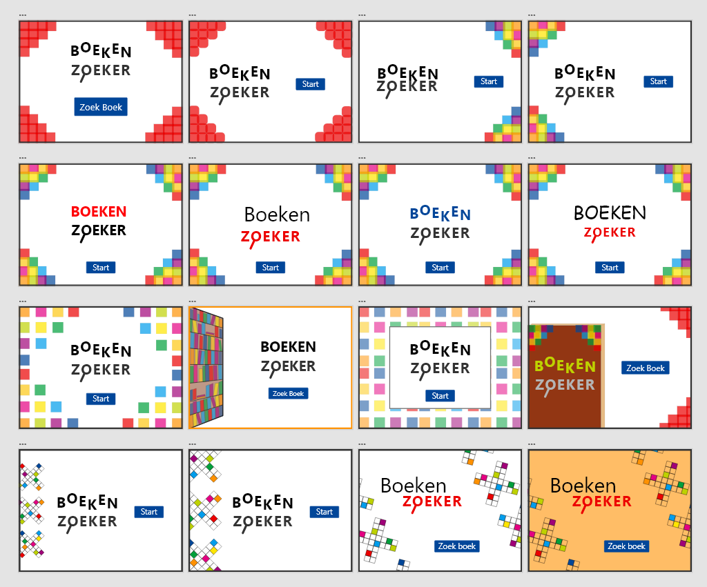
The photo provided is a sketch of the first title screen idea I had for this project, I made more sketches after this one as you will see below with the photos, but something intrigued me with this idea. I wanted to incorporate the bright secondary colors from the style guide, to appeal to the younger target audience of the app. I also knew I wanted to make the background, as well as the buttons with those colors, given the playful and happy nature it would make.
Iterations
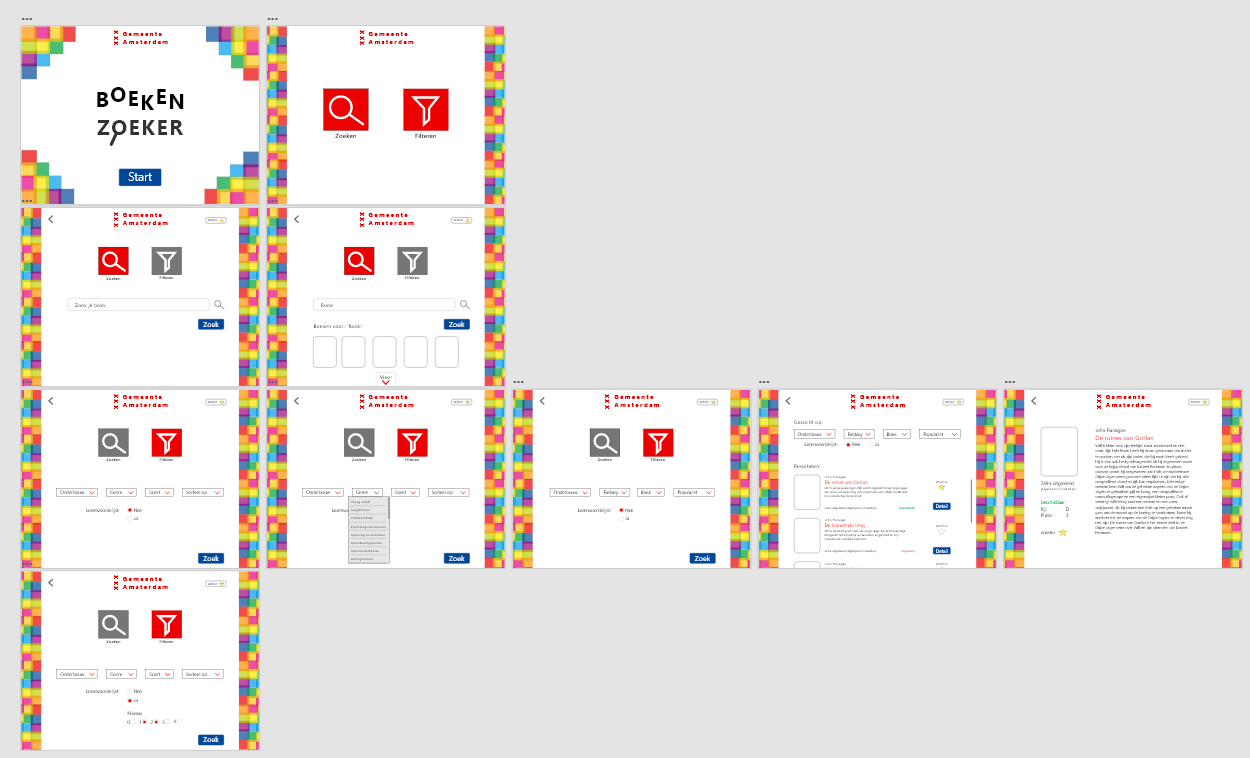
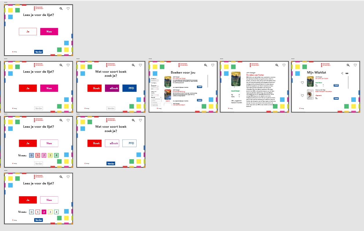
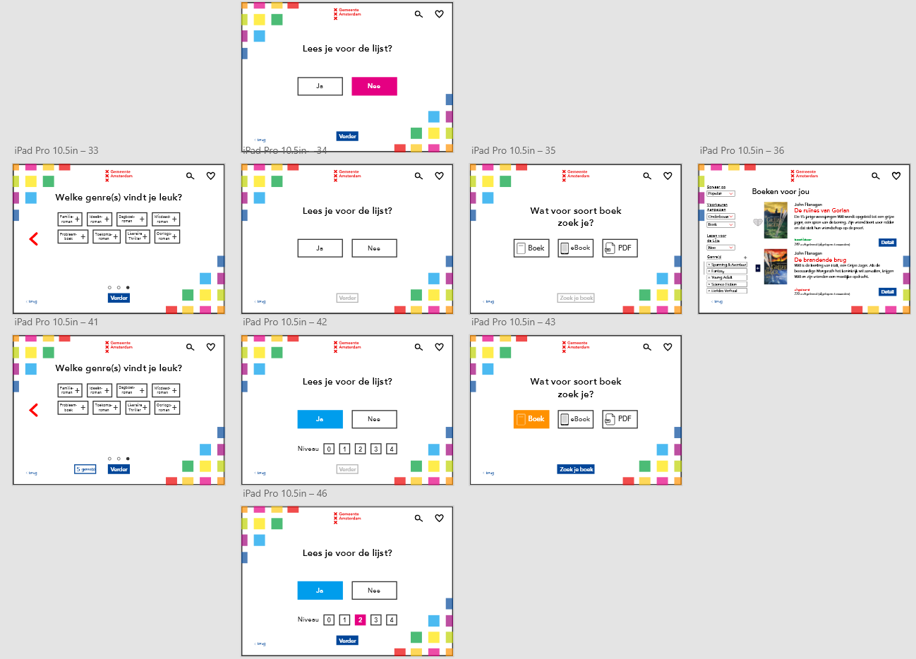
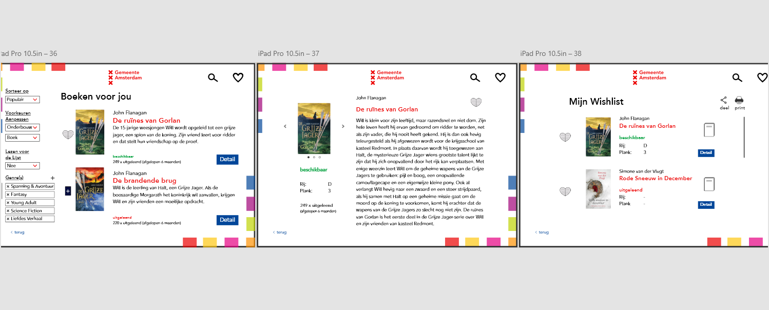
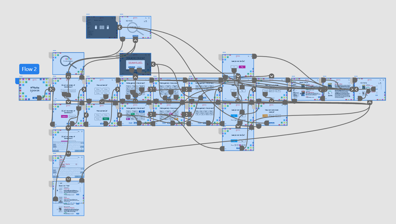
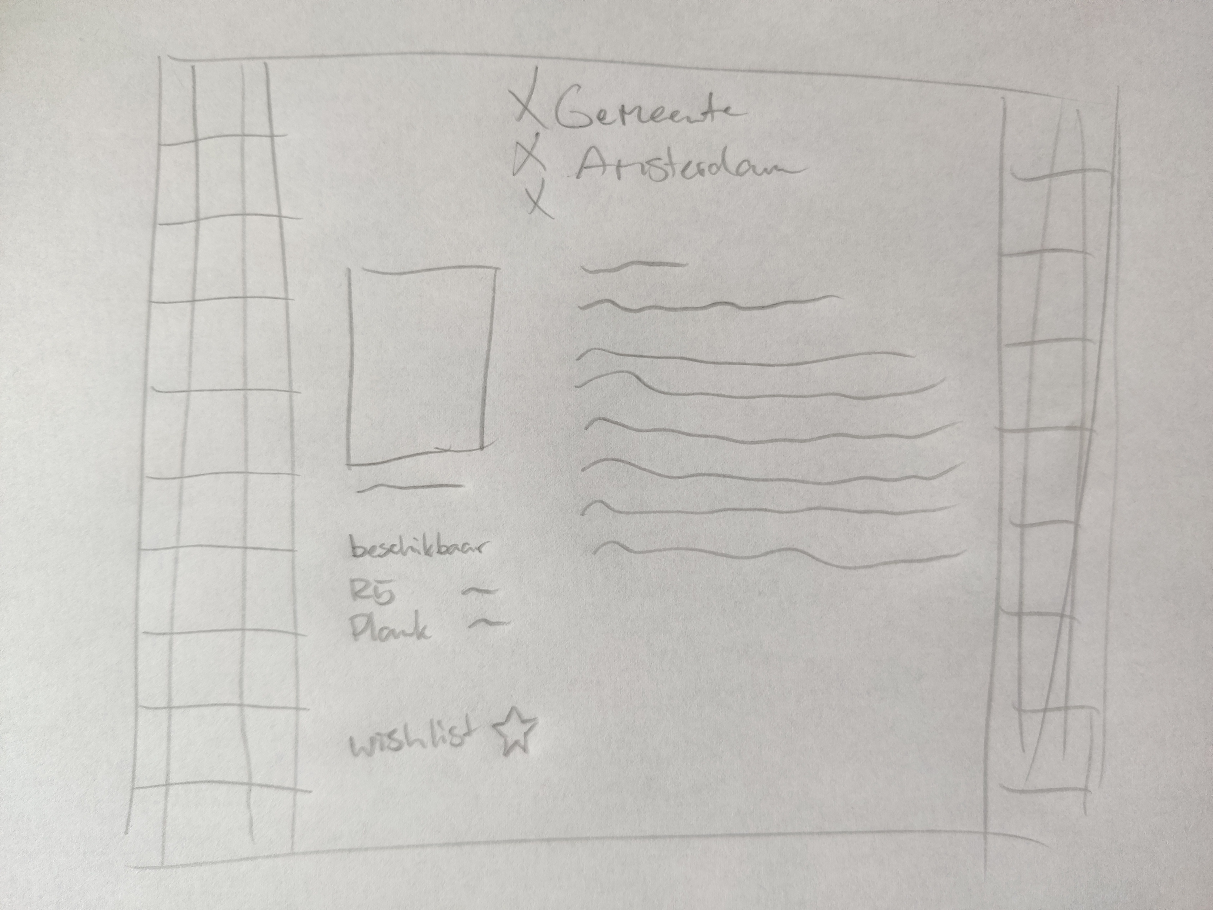
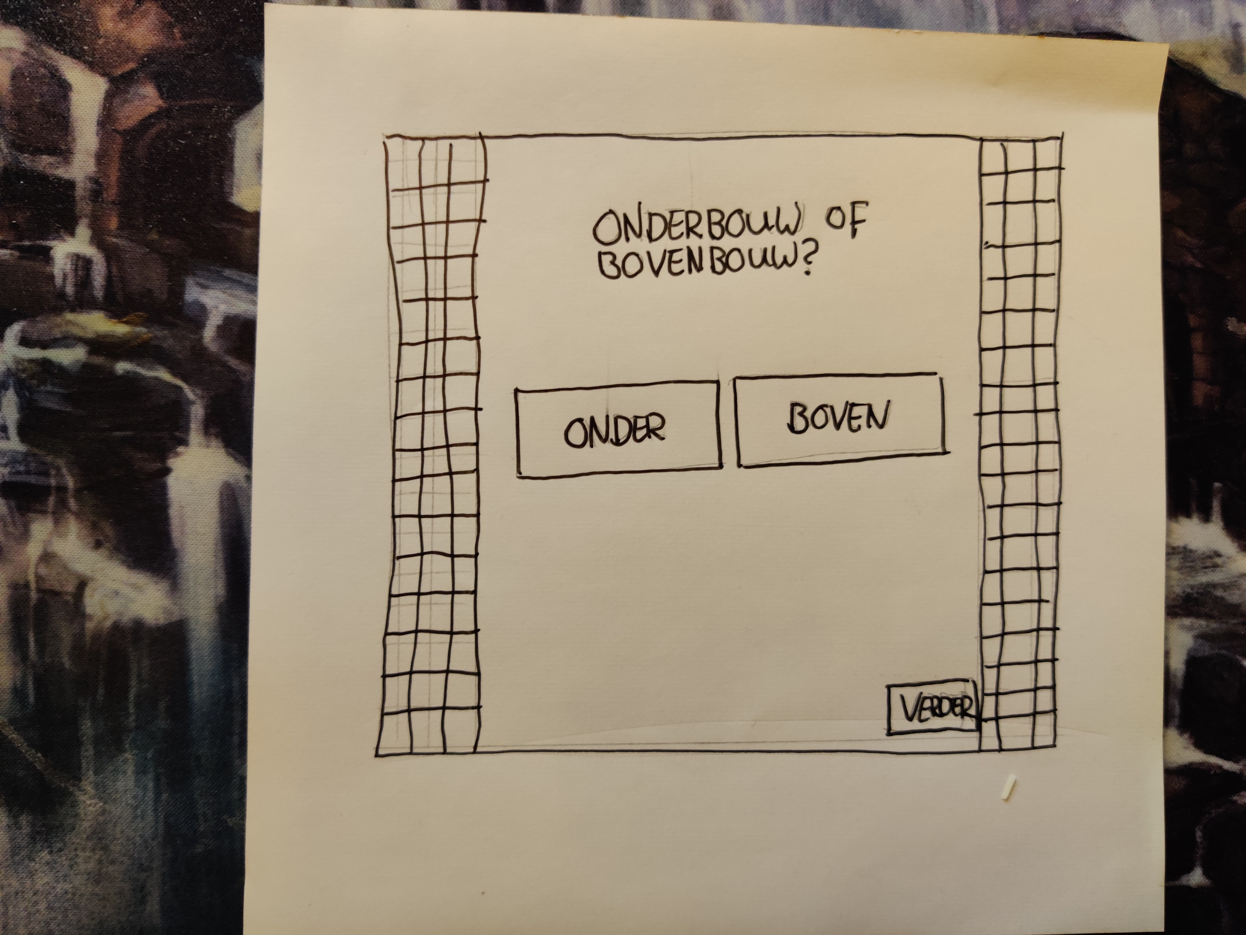
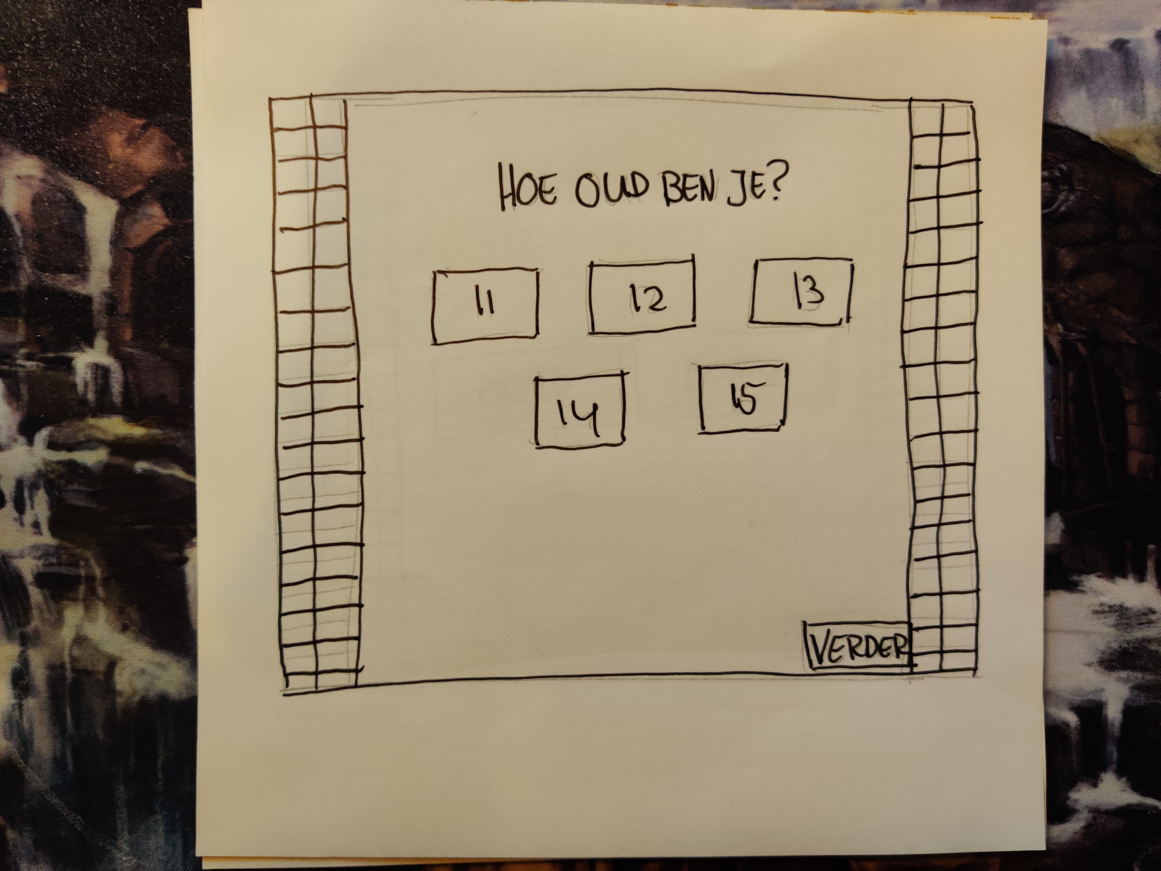
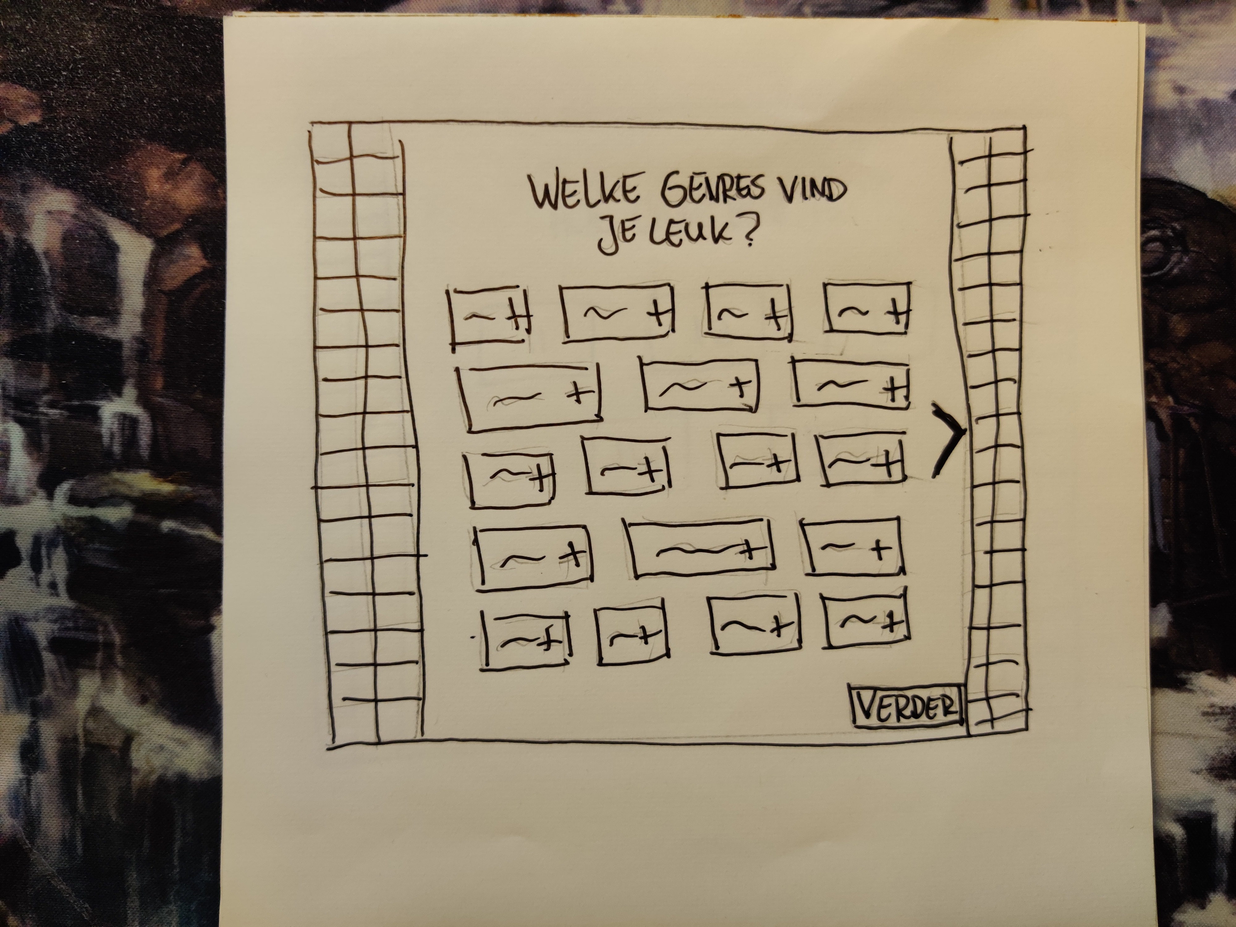
After making some sketches, I started making the first version on Adobe XD. I started with making the sketch I made into a digital version, and make a few variations for background for the other screens. From those variations I continued to work out one of those variations into a bigger screenflow.
AFter feedback for this early version, I quickly transformed to a more user friendly design (iteration 2). This version became too busy however, and I decided to change the idea of the side borders. To do this, I took a step back again, and decided to try out a few other title screen desings, in hope of that that would spark my creative flow for the other screens as well.
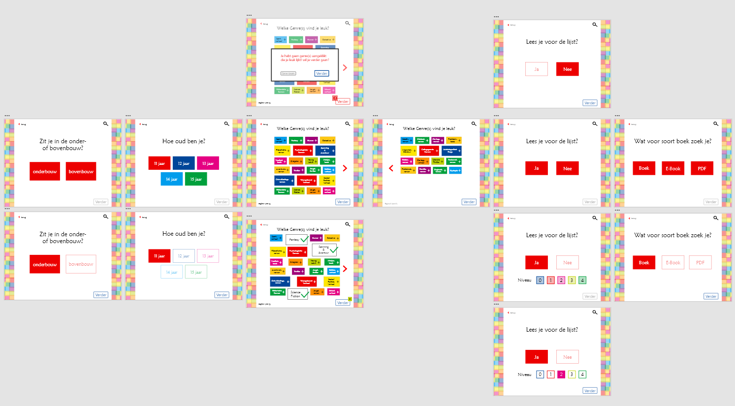
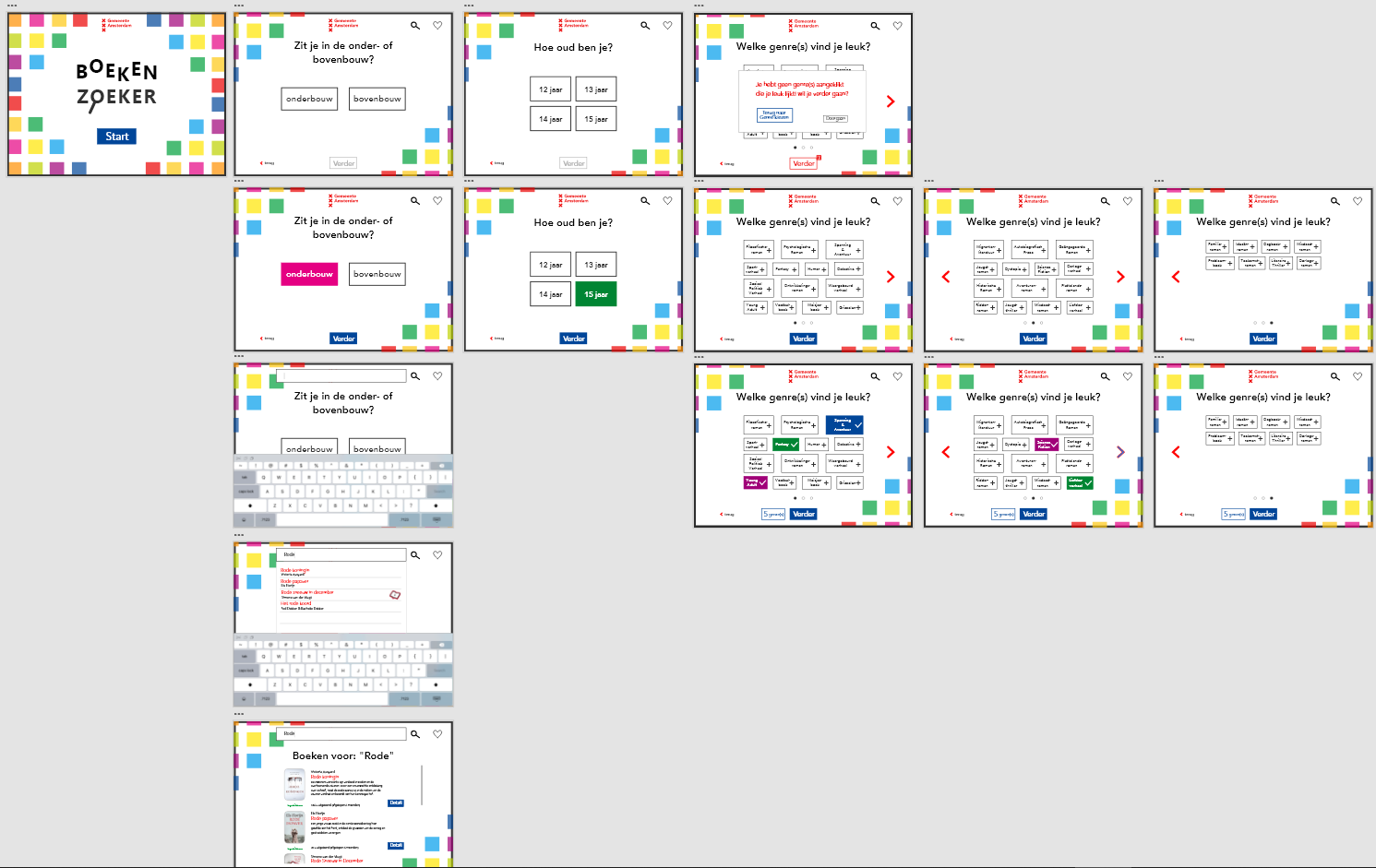
This worked quite well, seeing that after making these versions, I soon realized the color overlapping blocks made no sense for quieter feeling. Luckily, I came up with one version where I still made use of the original idea of the blocks for the title screen, but put them further apart to create some calmnness with the white spaces, while keeping it fun and youthful, appropriate for the target audience.
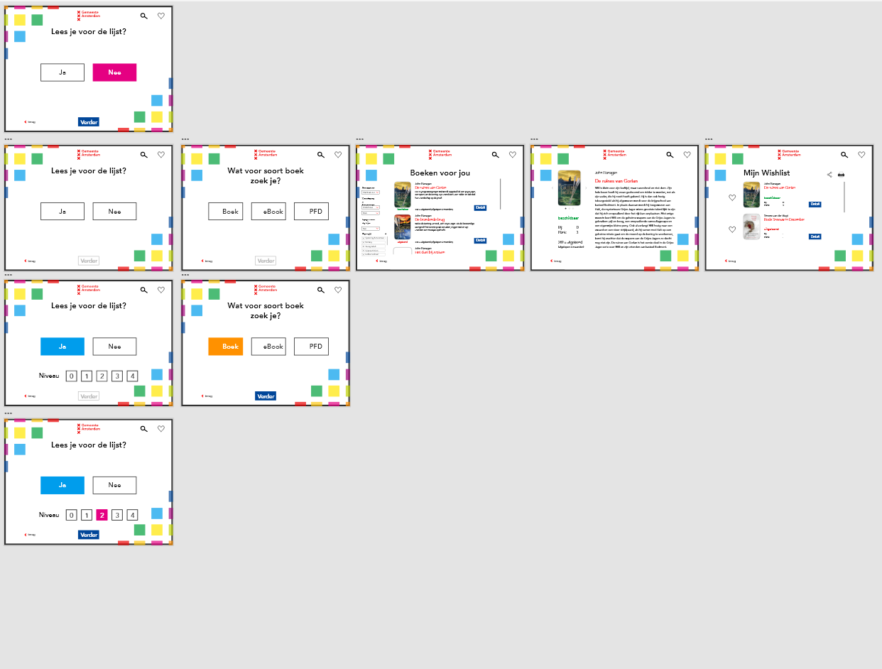
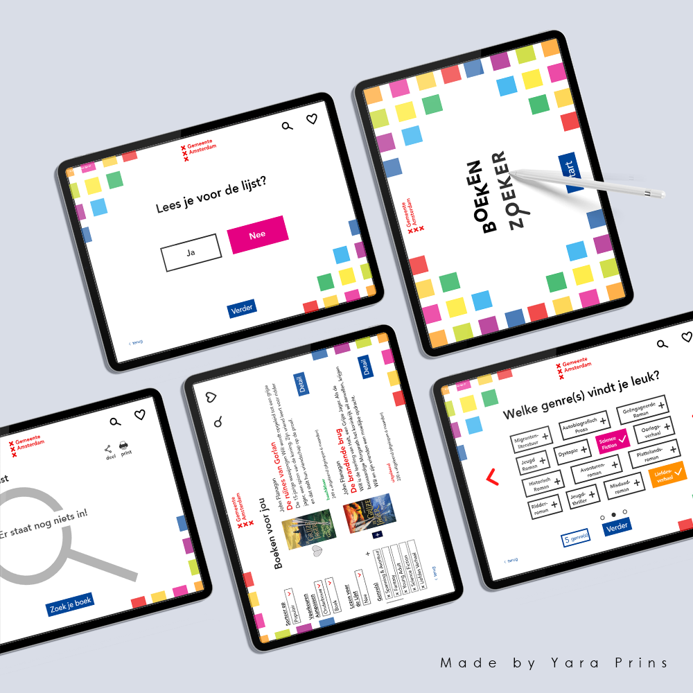
This version felt a lot cleaner, but was still missing something. It still felt a bit too overwhelming, so I decided to make one last iteration, this time with only having the buttons colors, once they have been selected. This really made the app look calm, but at the same time very exciting and youthful when interacted with.
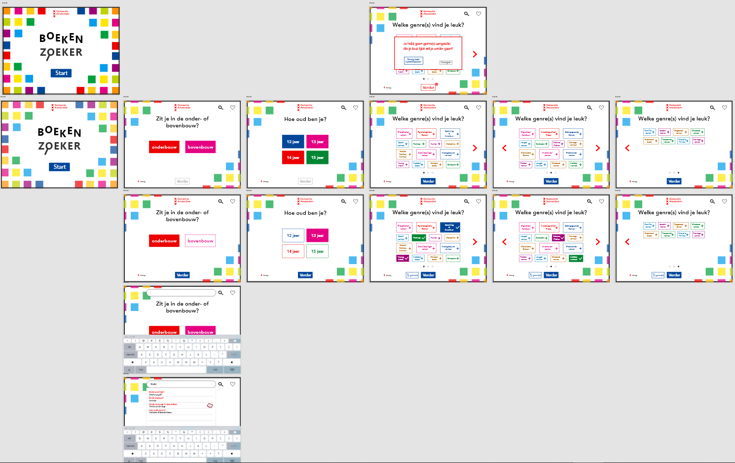
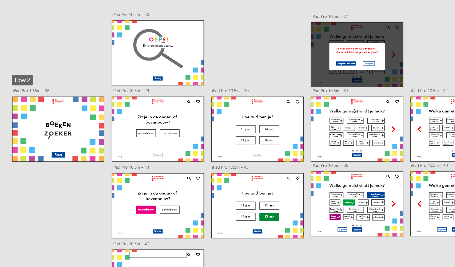
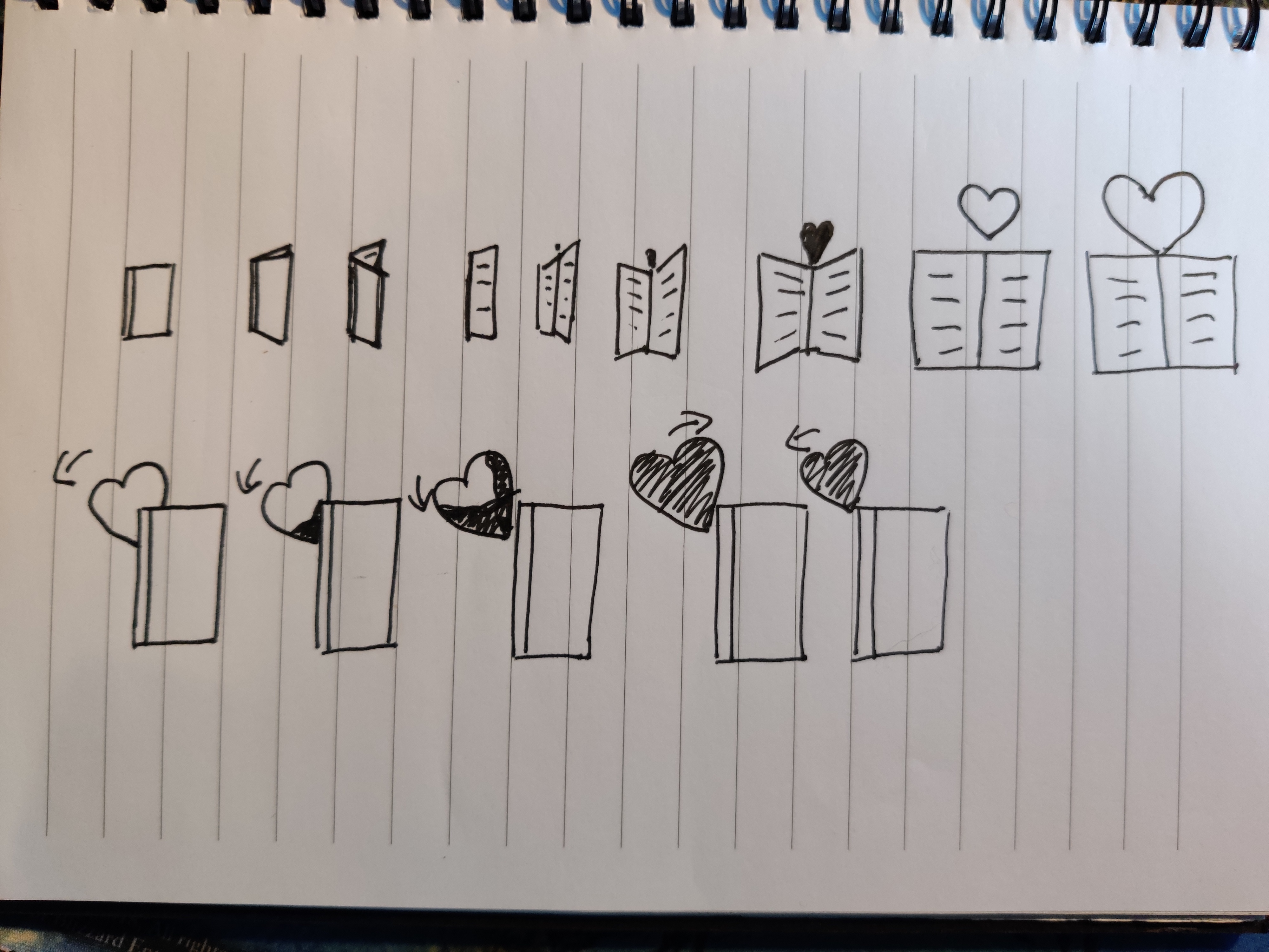
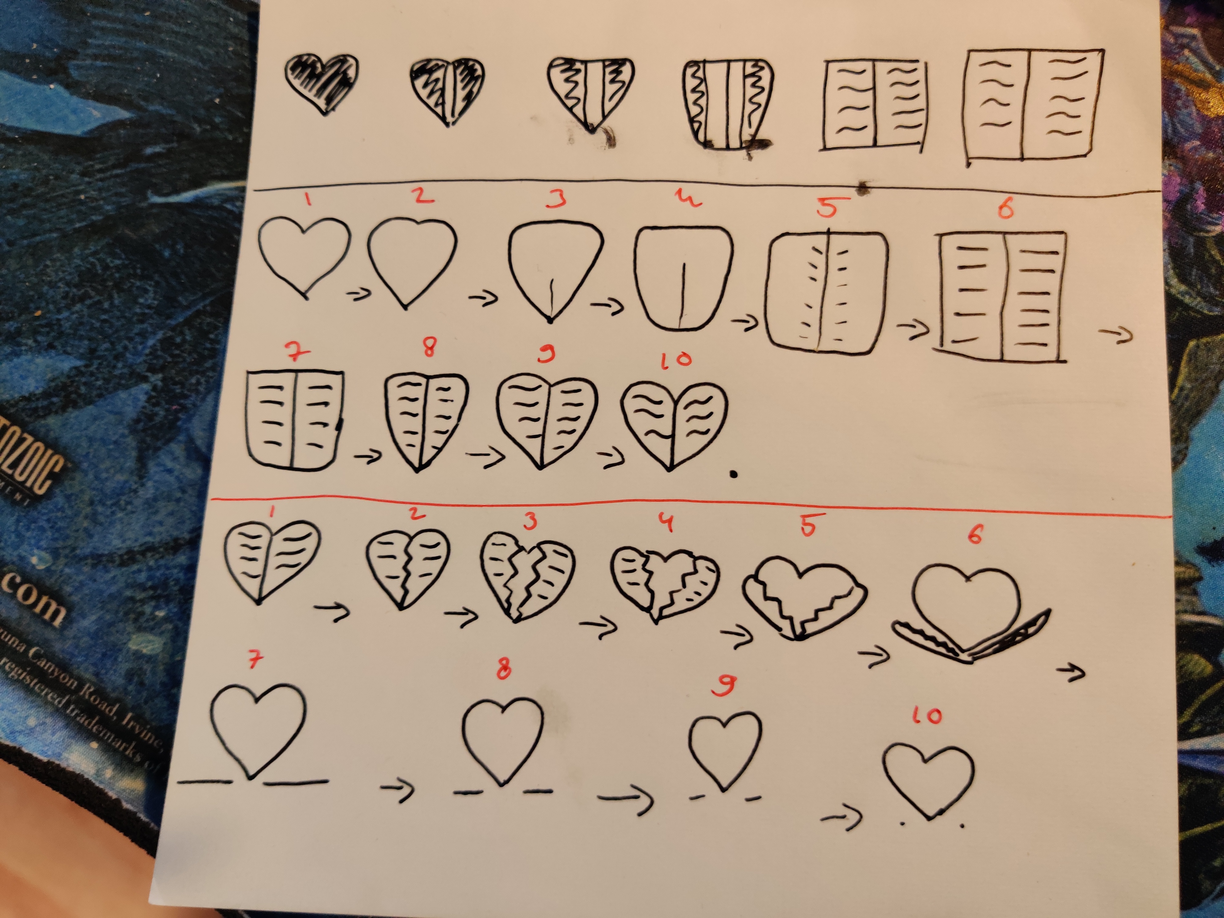
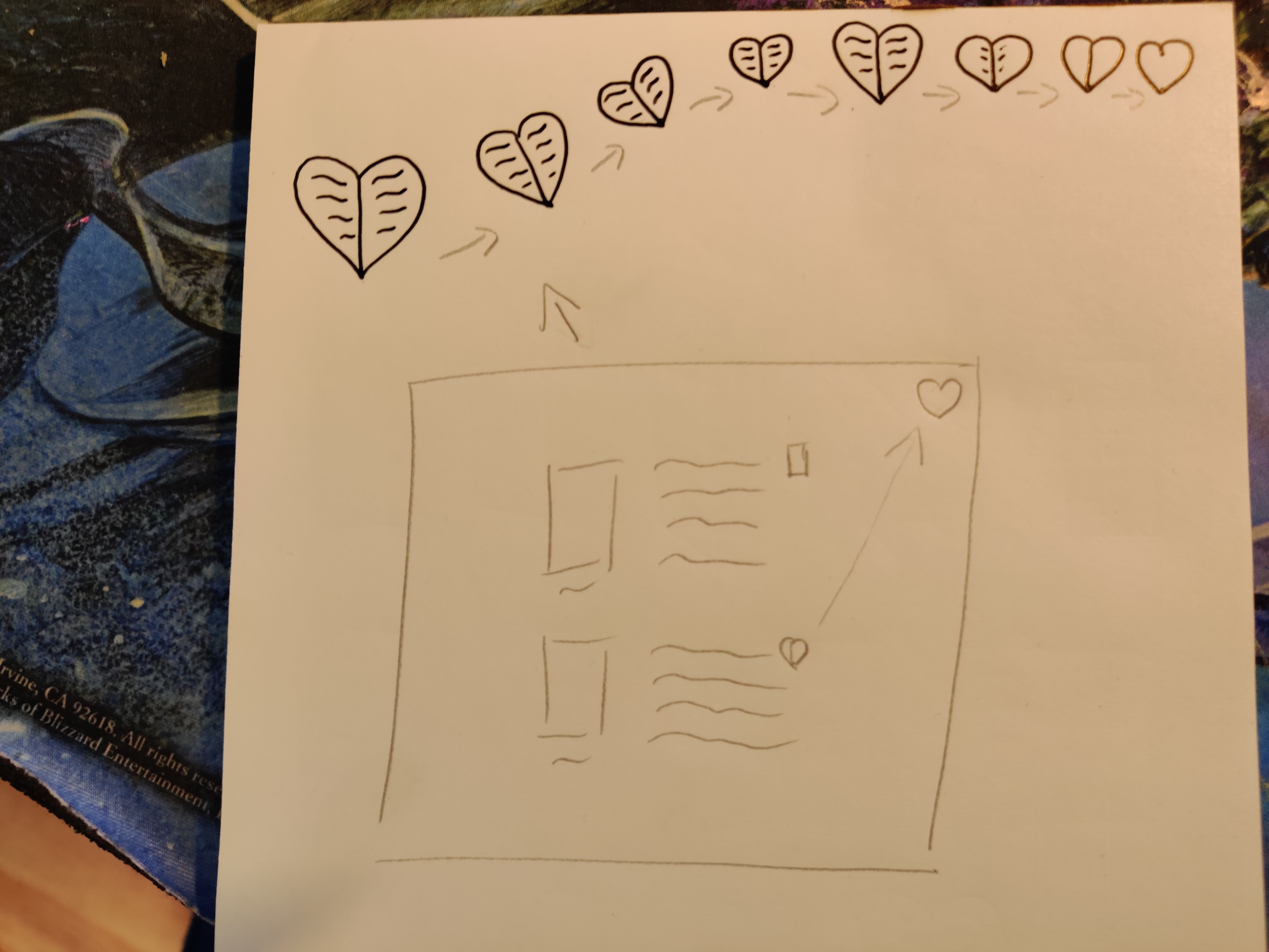
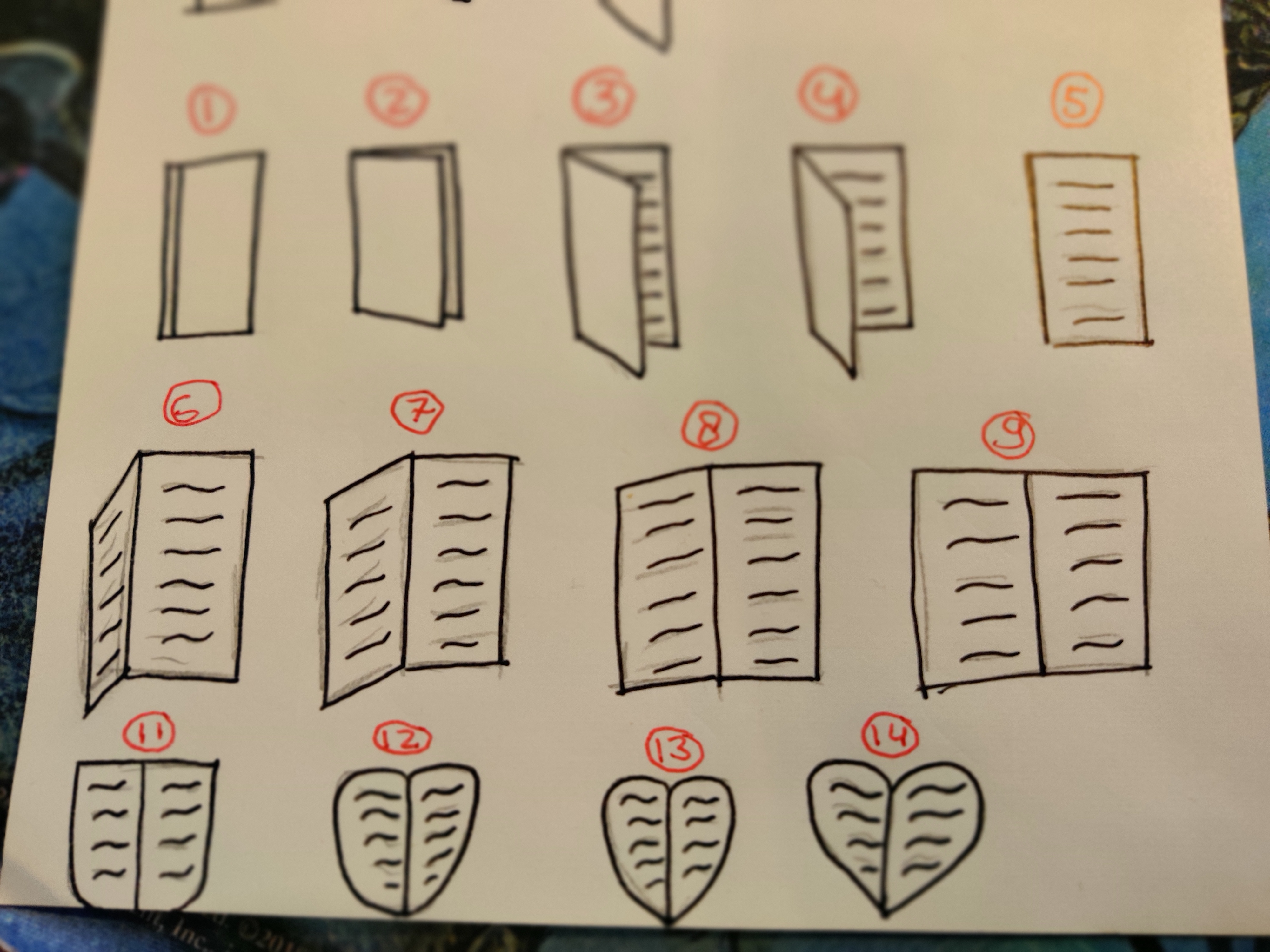
Lastly I added some other state screens (error, initial, etc.), added icons and made an animation for adding things to your wishlist on this app (I have made sketches for the latter, and made the animation itself in InVision, but wasn't able to imbed the animation into the prototype. I did however made a screenshot of how the animation should look like, with a screenflow).
Sketches
Iterations